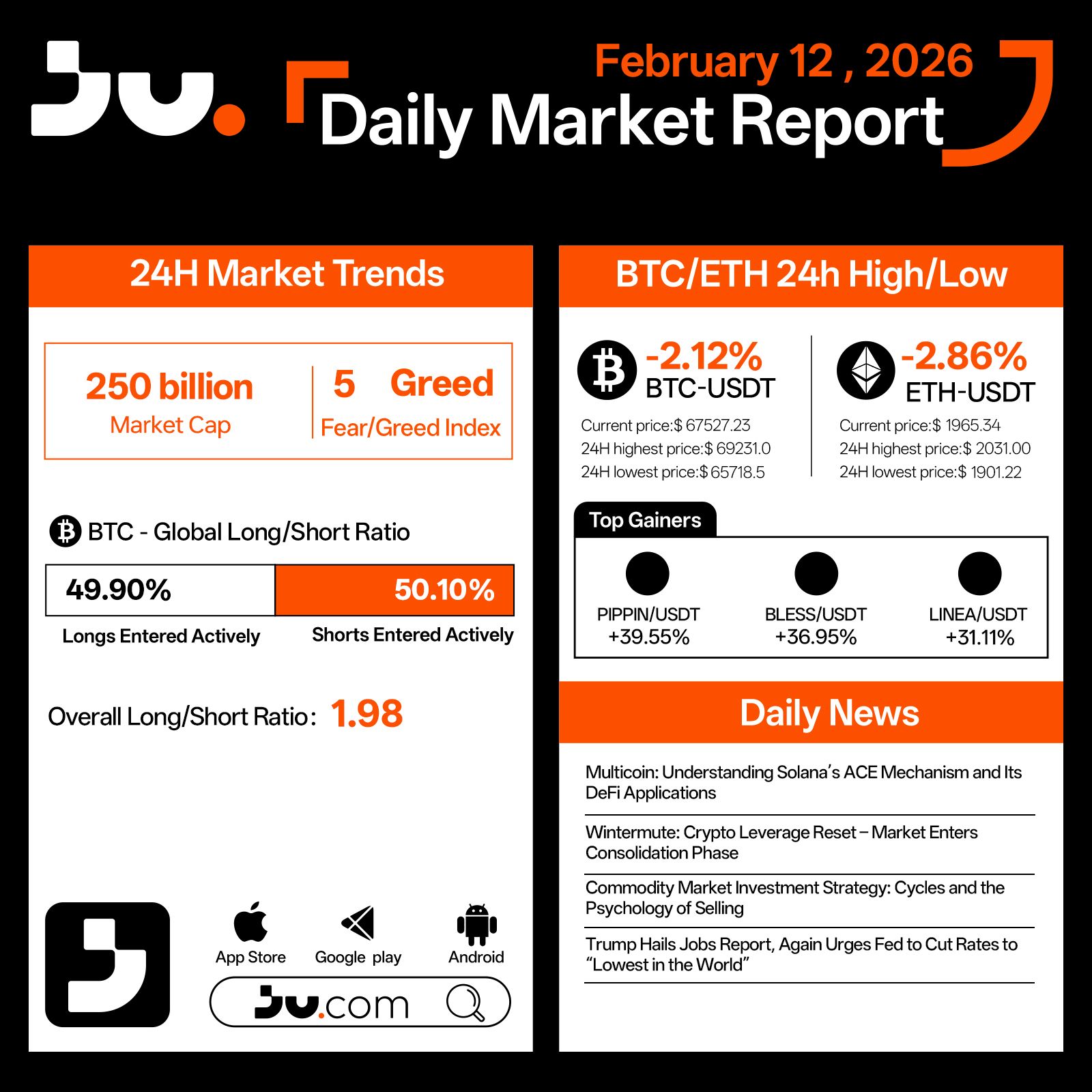
On February 12, the crypto market extended its decline, with total market capitalization falling to $250 billion. The Fear & Greed Index plunged to 5, marking one of the lowest readings of the current cycle and signaling extreme market anxiety. Liquidity remains tight, and post-leverage liquidation dynamics continue to shape price action.
Bitcoin dropped 2.12% to $67,527.23, trading between $65,718.5 and $69,231.0 during the session. Long positions account for 49.90%, while shorts stand at 50.10%, with an aggregate long–short ratio of 1.98, indicating near-balanced positioning despite continued downward pressure. The breakdown below key psychological levels has reinforced cautious sentiment, and volatility remains elevated.
Ethereum declined 2.86% to $1,965.34, with an intraday low of $1,901.22. As a higher-beta asset, ETH continues to exhibit greater downside sensitivity compared to BTC, reflecting ongoing risk reduction across the broader market.
Among top performers, PIPPIN, BLESS, and LINEA recorded strong gains, largely driven by tactical flows and sector rotation rather than a broad-based recovery in sentiment.
From a narrative perspective, Multicoin’s analysis of Solana’s ACE mechanism and its DeFi applications highlights continued innovation within high-performance blockchain ecosystems. Wintermute suggests that following a broad leverage reset, the market may enter a consolidation phase. Discussions surrounding commodity cycles and selling psychology further underscore prevailing macro uncertainty. Meanwhile, renewed political pressure for aggressive rate cuts adds another layer of complexity to risk asset pricing.
Overall, February 12 reflects a market in extreme fear territory. While such readings can historically coincide with late-stage capitulation, the absence of a clear liquidity or policy pivot suggests that consolidation at lower levels may persist before a more sustainable recovery emerges.
#cryptocurrency #blockchain #technical analysis #JU #Jucom


JU Blog
2026-02-12 04:28
Extreme Fear Deepens as Market Tests Lower Boundaries - Daily Market Report | February 12, 2026
Disclaimer:Contains third-party content. Not financial advice.
See Terms and Conditions.
How Futures Delivery Volumes Confirm Technical Signals in Financial Markets
Understanding the Role of Delivery Volumes in Futures Trading
Futures contracts are agreements to buy or sell an asset at a predetermined price on a future date. While many traders use these instruments for hedging or speculation, not all futures contracts result in actual delivery. Instead, most are closed out before expiration through offsetting trades or rolled over into new contracts. However, the volume of contracts that do reach delivery—known as futures delivery volumes—serves as a vital indicator of market activity and sentiment.
Delivery volumes reflect real market participation because they involve actual transfer of assets at contract expiry. High delivery volumes suggest strong conviction among traders and robust liquidity, indicating that participants are willing to hold positions until settlement. Conversely, low delivery volumes may imply that most traders prefer to close their positions early, perhaps due to uncertainty or lack of confidence in the underlying asset’s direction.
Technical signals—derived from chart patterns and quantitative indicators—are widely used by traders to forecast future price movements. These signals include moving averages, RSI (Relative Strength Index), Bollinger Bands, and other tools designed to identify potential trend reversals or continuations based on historical data.
The Interplay Between Delivery Volumes and Technical Analysis
While technical analysis provides valuable insights into potential market moves, its effectiveness can be enhanced by considering futures delivery volumes. The relationship between these two factors helps confirm whether observed technical signals truly reflect underlying market strength.
For example:
Market Sentiment Confirmation: When technical indicators signal an upward trend—such as a breakout above resistance levels—and high delivery volumes accompany this move, it reinforces the likelihood that the trend is genuine rather than a false signal.
Liquidity Validation: Strong technical signals often rely on sufficient liquidity for execution without significant slippage. Elevated delivery volumes indicate active trading and liquidity support these signals' reliability.
Contradiction Detection: If technical analysis suggests bullish momentum but delivery volumes remain low during key price moves, it raises questions about the sustainability of such trends since they might be driven by speculative activity rather than genuine conviction.
This synergy between technical signals and actual market participation helps traders avoid false positives and make more informed decisions based on confirmed trends rather than mere chart patterns alone.
Recent Trends: Cryptocurrency Markets & Regulatory Impacts
The recent years have seen notable developments where futures delivery volumes intersect with evolving regulatory landscapes and volatile markets like cryptocurrencies.
In 2021’s Bitcoin bull run, high delivery volumes coincided with strong bullish technical patterns such as ascending triangles and moving average crossovers above resistance levels. This alignment provided confirmation for many investors that upward momentum was backed by substantial trader commitment—a key factor behind sustained rally phases.
On the regulatory front, changes like stricter margin requirements introduced by authorities such as the Commodity Futures Trading Commission (CFTC) have impacted both liquidity levels and how traders approach futures markets. Such measures can lead to fluctuations in both trading volume dynamics—including deliveries—and how well technical signals hold up under different regulatory conditions.
Additionally, during periods of heightened volatility triggered by events like COVID-19 pandemic shocks in 2020–2021 — which saw increased safe-haven demand for gold —delivery volume spikes were observed alongside sharp movements indicated by various technical tools (e.g., RSI oversold/overbought conditions). These instances underscore how external factors influence both actual contract settlements and perceived trend directions derived from charts.
Key Metrics Used To Analyze Delivery Volumes And Technical Signals
To effectively interpret how futures deliverability confirms or contradicts technical outlooks requires familiarity with several core metrics:
Open Interest: Represents total outstanding contracts; rising open interest alongside increasing prices often indicates strengthening trends supported by new money entering the market.
Settlement Ratio: The percentage of total contracts settled at expiration; higher ratios suggest more participants are committed until final settlement.
Implied Volatility: Derived from options prices; elevated implied volatility can coincide with uncertain markets where confirmation via physical deliveries becomes particularly relevant.
On the analytical side:
Moving Averages (MA): Help smooth out short-term fluctuations; crossovers can signal entry/exit points when supported by corresponding volume increases.
RSI (Relative Strength Index): Indicates overbought/oversold conditions; confirming RSI extremes with high deliverable contract activity adds weight to potential reversals.
Bollinger Bands: Measure volatility; contractions followed by expanding bands coupled with rising deliveries may precede significant breakouts or breakdowns.
Why Combining Delivery Data With Technical Analysis Matters
Relying solely on chart patterns without considering real-world data like futures deliveries can lead traders astray due to false signals caused by manipulation or speculative behavior lacking fundamental backing. Incorporating actual settlement data ensures that observed trends aren’t just illusions created within trading screens but reflect genuine investor commitment across markets.
For instance:
A sudden surge in open interest combined with rising physical deliveries indicates strong buying interest supporting an ongoing rally—a positive sign for long-term investors seeking confirmation before entering positions.*
Conversely,
Technical signs pointing toward reversal accompanied only by minimal settlement activity might warn against prematurely exiting trades since underlying fundamentals don’t support such shifts.
Implications for Traders & Investors
Understanding how futures delivery volumes confirm—or challenge—the validity of technical signals equips market participants with better decision-making tools:
- It enhances confidence when making entries aligned with confirmed trends supported by tangible commitments.
- It helps identify potential divergences where charts show one picture but real-market activity suggests another—prompting caution or further analysis.
- Recognizing external influences like regulatory changes allows anticipation of shifts in both trading behavior and underlying metrics affecting future developments.
Tracking Market Dynamics Over Time
Historical examples demonstrate how integrating these two aspects yields clearer insights into overall market health:
During 2020’s crash amid COVID fears: Gold’s increased physical settlements validated its role as a safe haven amidst volatile charts showing oversold conditions via RSI readings.
In cryptocurrency markets: High Bitcoin derivatives’ open interest coupled with large-scale spot transactions reinforced bullish narratives during major rallies.
Final Thoughts: Using Data To Improve Market Predictions
Combining futures delivery data with robust technical analysis creates a more comprehensive view essential for navigating complex financial landscapes today’s dynamic markets present—from traditional commodities to digital assets like cryptocurrencies—all influenced heavily by macroeconomic factors including regulation policies worldwide.
By paying attention not just to what charts tell us but also verifying whether those indications align with concrete transaction activities through delivered contracts—we gain deeper insight into true market strength versus fleeting speculation.
This integrated approach supports smarter risk management strategies while enhancing our ability to anticipate major turning points ahead of time—a crucial advantage amid increasing global financial interconnectedness

JCUSER-F1IIaxXA
2025-05-10 00:20
How can futures delivery volumes confirm technical signals?
How Futures Delivery Volumes Confirm Technical Signals in Financial Markets
Understanding the Role of Delivery Volumes in Futures Trading
Futures contracts are agreements to buy or sell an asset at a predetermined price on a future date. While many traders use these instruments for hedging or speculation, not all futures contracts result in actual delivery. Instead, most are closed out before expiration through offsetting trades or rolled over into new contracts. However, the volume of contracts that do reach delivery—known as futures delivery volumes—serves as a vital indicator of market activity and sentiment.
Delivery volumes reflect real market participation because they involve actual transfer of assets at contract expiry. High delivery volumes suggest strong conviction among traders and robust liquidity, indicating that participants are willing to hold positions until settlement. Conversely, low delivery volumes may imply that most traders prefer to close their positions early, perhaps due to uncertainty or lack of confidence in the underlying asset’s direction.
Technical signals—derived from chart patterns and quantitative indicators—are widely used by traders to forecast future price movements. These signals include moving averages, RSI (Relative Strength Index), Bollinger Bands, and other tools designed to identify potential trend reversals or continuations based on historical data.
The Interplay Between Delivery Volumes and Technical Analysis
While technical analysis provides valuable insights into potential market moves, its effectiveness can be enhanced by considering futures delivery volumes. The relationship between these two factors helps confirm whether observed technical signals truly reflect underlying market strength.
For example:
Market Sentiment Confirmation: When technical indicators signal an upward trend—such as a breakout above resistance levels—and high delivery volumes accompany this move, it reinforces the likelihood that the trend is genuine rather than a false signal.
Liquidity Validation: Strong technical signals often rely on sufficient liquidity for execution without significant slippage. Elevated delivery volumes indicate active trading and liquidity support these signals' reliability.
Contradiction Detection: If technical analysis suggests bullish momentum but delivery volumes remain low during key price moves, it raises questions about the sustainability of such trends since they might be driven by speculative activity rather than genuine conviction.
This synergy between technical signals and actual market participation helps traders avoid false positives and make more informed decisions based on confirmed trends rather than mere chart patterns alone.
Recent Trends: Cryptocurrency Markets & Regulatory Impacts
The recent years have seen notable developments where futures delivery volumes intersect with evolving regulatory landscapes and volatile markets like cryptocurrencies.
In 2021’s Bitcoin bull run, high delivery volumes coincided with strong bullish technical patterns such as ascending triangles and moving average crossovers above resistance levels. This alignment provided confirmation for many investors that upward momentum was backed by substantial trader commitment—a key factor behind sustained rally phases.
On the regulatory front, changes like stricter margin requirements introduced by authorities such as the Commodity Futures Trading Commission (CFTC) have impacted both liquidity levels and how traders approach futures markets. Such measures can lead to fluctuations in both trading volume dynamics—including deliveries—and how well technical signals hold up under different regulatory conditions.
Additionally, during periods of heightened volatility triggered by events like COVID-19 pandemic shocks in 2020–2021 — which saw increased safe-haven demand for gold —delivery volume spikes were observed alongside sharp movements indicated by various technical tools (e.g., RSI oversold/overbought conditions). These instances underscore how external factors influence both actual contract settlements and perceived trend directions derived from charts.
Key Metrics Used To Analyze Delivery Volumes And Technical Signals
To effectively interpret how futures deliverability confirms or contradicts technical outlooks requires familiarity with several core metrics:
Open Interest: Represents total outstanding contracts; rising open interest alongside increasing prices often indicates strengthening trends supported by new money entering the market.
Settlement Ratio: The percentage of total contracts settled at expiration; higher ratios suggest more participants are committed until final settlement.
Implied Volatility: Derived from options prices; elevated implied volatility can coincide with uncertain markets where confirmation via physical deliveries becomes particularly relevant.
On the analytical side:
Moving Averages (MA): Help smooth out short-term fluctuations; crossovers can signal entry/exit points when supported by corresponding volume increases.
RSI (Relative Strength Index): Indicates overbought/oversold conditions; confirming RSI extremes with high deliverable contract activity adds weight to potential reversals.
Bollinger Bands: Measure volatility; contractions followed by expanding bands coupled with rising deliveries may precede significant breakouts or breakdowns.
Why Combining Delivery Data With Technical Analysis Matters
Relying solely on chart patterns without considering real-world data like futures deliveries can lead traders astray due to false signals caused by manipulation or speculative behavior lacking fundamental backing. Incorporating actual settlement data ensures that observed trends aren’t just illusions created within trading screens but reflect genuine investor commitment across markets.
For instance:
A sudden surge in open interest combined with rising physical deliveries indicates strong buying interest supporting an ongoing rally—a positive sign for long-term investors seeking confirmation before entering positions.*
Conversely,
Technical signs pointing toward reversal accompanied only by minimal settlement activity might warn against prematurely exiting trades since underlying fundamentals don’t support such shifts.
Implications for Traders & Investors
Understanding how futures delivery volumes confirm—or challenge—the validity of technical signals equips market participants with better decision-making tools:
- It enhances confidence when making entries aligned with confirmed trends supported by tangible commitments.
- It helps identify potential divergences where charts show one picture but real-market activity suggests another—prompting caution or further analysis.
- Recognizing external influences like regulatory changes allows anticipation of shifts in both trading behavior and underlying metrics affecting future developments.
Tracking Market Dynamics Over Time
Historical examples demonstrate how integrating these two aspects yields clearer insights into overall market health:
During 2020’s crash amid COVID fears: Gold’s increased physical settlements validated its role as a safe haven amidst volatile charts showing oversold conditions via RSI readings.
In cryptocurrency markets: High Bitcoin derivatives’ open interest coupled with large-scale spot transactions reinforced bullish narratives during major rallies.
Final Thoughts: Using Data To Improve Market Predictions
Combining futures delivery data with robust technical analysis creates a more comprehensive view essential for navigating complex financial landscapes today’s dynamic markets present—from traditional commodities to digital assets like cryptocurrencies—all influenced heavily by macroeconomic factors including regulation policies worldwide.
By paying attention not just to what charts tell us but also verifying whether those indications align with concrete transaction activities through delivered contracts—we gain deeper insight into true market strength versus fleeting speculation.
This integrated approach supports smarter risk management strategies while enhancing our ability to anticipate major turning points ahead of time—a crucial advantage amid increasing global financial interconnectedness
Disclaimer:Contains third-party content. Not financial advice.
See Terms and Conditions.
What Is a Renko Tick Chart?
A Renko tick chart is a specialized type of technical analysis tool used by traders to visualize price movements more clearly than traditional charts like candlesticks or line graphs. Unlike time-based charts, Renko charts focus solely on price changes, making them particularly useful for identifying trends and filtering out market noise. This characteristic allows traders to better understand the strength and direction of market movements, especially in volatile environments such as cryptocurrency markets.
The core concept behind a Renko tick chart involves constructing bricks or boxes that represent a fixed amount of price movement—known as the "box size." Each brick is drawn upward or downward depending on whether the price has increased or decreased by this predetermined amount. Importantly, these bricks are not tied to specific time intervals; instead, they are generated based purely on price action. As such, if prices remain stagnant for a period, no new bricks will form until sufficient movement occurs.
This unique approach makes Renko tick charts highly effective at highlighting significant trends while minimizing distractions caused by minor fluctuations. Traders often prefer them when they want to focus on strong directional moves rather than short-term volatility.
How Does a Renko Tick Chart Work?
Understanding how a Renko tick chart functions requires grasping its fundamental construction process. The process begins with selecting an appropriate box size—this could be set in points (e.g., 10 pips), dollars (e.g., $1), or percentage terms depending on the asset class and trading style.
Once configured:
- When the price moves upward by at least one box size from the last brick’s closing point, an upward brick is added.
- Conversely, if it drops downward by that same amount, a downward brick appears.
- If there’s no sufficient movement in either direction within that period, no new bricks are formed until enough change occurs.
Because each brick represents only significant movements beyond minor fluctuations or noise, this method filters out insignificant data points that might clutter traditional charts. The result is a cleaner visual representation emphasizing trend clarity over granular detail.
Another key feature of renko tick charts is their lack of an explicit time axis. This means that two periods with identical trend structures may look similar regardless of how much time has passed between them—a trait beneficial for spotting persistent trends but requiring supplementary tools to analyze timing aspects effectively.
Advantages of Using Renko Tick Charts
Renko tick charts offer several benefits over conventional chart types:
Clear Trend Identification:
By focusing solely on meaningful price changes and ignoring small oscillations, these charts make it easier for traders to spot sustained trends early and accurately.
Noise Reduction:
Traditional candlestick or line charts can be cluttered with minor fluctuations which may lead traders astray; renkos eliminate much of this noise through their box-based structure.
Visual Simplicity:
The straightforward appearance helps both novice and experienced traders quickly interpret market direction without being overwhelmed by complex patterns typical in other formats.
Adaptability Across Markets:
Renko ticks work well across various financial instruments—including stocks, forex pairs—and have gained popularity among cryptocurrency traders due to their ability to handle high volatility efficiently.
Limitations To Keep In Mind
Despite their advantages, renkos aren’t perfect tools:
- No Time Context: Since they omit temporal information entirely—focusing only on prices—they can obscure when particular events occurred unless combined with other indicators.
- Potential Overemphasis On Trends: Traders relying solely on renkos might miss reversals if they don’t incorporate additional signals like volume analysis or oscillators.
- Parameter Sensitivity: Choosing an inappropriate box size can lead either to too many bricks (overly sensitive) or too few (missed details). Fine-tuning based on asset volatility is essential.
Recent Trends: Cryptocurrency Trading With Renko Charts
In recent years — especially during 2020–2021 crypto bull runs — many cryptocurrency traders adopted renko tick charts as part of their technical toolkit. The extreme volatility characteristic of digital assets makes traditional analysis challenging; however,
renkos help highlight dominant trends amidst rapid swings,
making it easier for investors and day-traders alike to identify entry and exit points more reliably.
Popular Strategies Using Renko Charts
Traders employ various approaches tailored around renkos:
Trend Following:
Identifying sustained directional moves allows traders to ride long-term trends until clear reversal signals emerge.Breakout Trading:
Monitoring when prices break above previous brick highs—or below lows—can signal potential entries into trending markets.Mean Reversion Tactics:
Some use renkos alongside oscillators like RSI (Relative Strength Index) to spot overbought/oversold conditions where reversals might occur.
Combining Tools For Better Results
While powerful alone, relying exclusively on renkopatterns risks missing critical context about timing or volume dynamics. Combining them with moving averages helps confirm trend strength; adding volume indicators provides insight into conviction behind moves; integrating time-based candles ensures awareness about event timing—all contribute toward more robust trading decisions.
Potential Risks And How To Mitigate Them
Overdependence remains one primary concern: using only renkopatterns could cause missed opportunities during quick reversals not yet reflected in bricks’ formation timescales. Additionally,
the absence of explicit temporal data may mislead some into assuming longer-lasting trends than actually exist.
To counteract these issues:
- Use multiple indicators alongside your renkobased strategy
- Adjust box sizes according to asset volatility
- Incorporate volume analysis for confirmation
- Regularly backtest your approach across different market conditions
Final Thoughts: Is A Renko Tick Chart Right For You?
Renko tick charts serve as valuable tools within any trader’s arsenal aiming for clearer trend visualization while reducing market noise interference—a particularly advantageous feature amid volatile markets like cryptocurrencies today . They excel at highlighting strong directional moves but should always be complemented with other analytical methods addressing timing and volume considerations.
By understanding how these unique visualizations work—and recognizing both their strengths and limitations—you can enhance your overall trading strategy effectively while maintaining risk awareness suited for professional investing standards.

Lo
2025-05-20 03:45
What’s a Renko tick chart?
What Is a Renko Tick Chart?
A Renko tick chart is a specialized type of technical analysis tool used by traders to visualize price movements more clearly than traditional charts like candlesticks or line graphs. Unlike time-based charts, Renko charts focus solely on price changes, making them particularly useful for identifying trends and filtering out market noise. This characteristic allows traders to better understand the strength and direction of market movements, especially in volatile environments such as cryptocurrency markets.
The core concept behind a Renko tick chart involves constructing bricks or boxes that represent a fixed amount of price movement—known as the "box size." Each brick is drawn upward or downward depending on whether the price has increased or decreased by this predetermined amount. Importantly, these bricks are not tied to specific time intervals; instead, they are generated based purely on price action. As such, if prices remain stagnant for a period, no new bricks will form until sufficient movement occurs.
This unique approach makes Renko tick charts highly effective at highlighting significant trends while minimizing distractions caused by minor fluctuations. Traders often prefer them when they want to focus on strong directional moves rather than short-term volatility.
How Does a Renko Tick Chart Work?
Understanding how a Renko tick chart functions requires grasping its fundamental construction process. The process begins with selecting an appropriate box size—this could be set in points (e.g., 10 pips), dollars (e.g., $1), or percentage terms depending on the asset class and trading style.
Once configured:
- When the price moves upward by at least one box size from the last brick’s closing point, an upward brick is added.
- Conversely, if it drops downward by that same amount, a downward brick appears.
- If there’s no sufficient movement in either direction within that period, no new bricks are formed until enough change occurs.
Because each brick represents only significant movements beyond minor fluctuations or noise, this method filters out insignificant data points that might clutter traditional charts. The result is a cleaner visual representation emphasizing trend clarity over granular detail.
Another key feature of renko tick charts is their lack of an explicit time axis. This means that two periods with identical trend structures may look similar regardless of how much time has passed between them—a trait beneficial for spotting persistent trends but requiring supplementary tools to analyze timing aspects effectively.
Advantages of Using Renko Tick Charts
Renko tick charts offer several benefits over conventional chart types:
Clear Trend Identification:
By focusing solely on meaningful price changes and ignoring small oscillations, these charts make it easier for traders to spot sustained trends early and accurately.
Noise Reduction:
Traditional candlestick or line charts can be cluttered with minor fluctuations which may lead traders astray; renkos eliminate much of this noise through their box-based structure.
Visual Simplicity:
The straightforward appearance helps both novice and experienced traders quickly interpret market direction without being overwhelmed by complex patterns typical in other formats.
Adaptability Across Markets:
Renko ticks work well across various financial instruments—including stocks, forex pairs—and have gained popularity among cryptocurrency traders due to their ability to handle high volatility efficiently.
Limitations To Keep In Mind
Despite their advantages, renkos aren’t perfect tools:
- No Time Context: Since they omit temporal information entirely—focusing only on prices—they can obscure when particular events occurred unless combined with other indicators.
- Potential Overemphasis On Trends: Traders relying solely on renkos might miss reversals if they don’t incorporate additional signals like volume analysis or oscillators.
- Parameter Sensitivity: Choosing an inappropriate box size can lead either to too many bricks (overly sensitive) or too few (missed details). Fine-tuning based on asset volatility is essential.
Recent Trends: Cryptocurrency Trading With Renko Charts
In recent years — especially during 2020–2021 crypto bull runs — many cryptocurrency traders adopted renko tick charts as part of their technical toolkit. The extreme volatility characteristic of digital assets makes traditional analysis challenging; however,
renkos help highlight dominant trends amidst rapid swings,
making it easier for investors and day-traders alike to identify entry and exit points more reliably.
Popular Strategies Using Renko Charts
Traders employ various approaches tailored around renkos:
Trend Following:
Identifying sustained directional moves allows traders to ride long-term trends until clear reversal signals emerge.Breakout Trading:
Monitoring when prices break above previous brick highs—or below lows—can signal potential entries into trending markets.Mean Reversion Tactics:
Some use renkos alongside oscillators like RSI (Relative Strength Index) to spot overbought/oversold conditions where reversals might occur.
Combining Tools For Better Results
While powerful alone, relying exclusively on renkopatterns risks missing critical context about timing or volume dynamics. Combining them with moving averages helps confirm trend strength; adding volume indicators provides insight into conviction behind moves; integrating time-based candles ensures awareness about event timing—all contribute toward more robust trading decisions.
Potential Risks And How To Mitigate Them
Overdependence remains one primary concern: using only renkopatterns could cause missed opportunities during quick reversals not yet reflected in bricks’ formation timescales. Additionally,
the absence of explicit temporal data may mislead some into assuming longer-lasting trends than actually exist.
To counteract these issues:
- Use multiple indicators alongside your renkobased strategy
- Adjust box sizes according to asset volatility
- Incorporate volume analysis for confirmation
- Regularly backtest your approach across different market conditions
Final Thoughts: Is A Renko Tick Chart Right For You?
Renko tick charts serve as valuable tools within any trader’s arsenal aiming for clearer trend visualization while reducing market noise interference—a particularly advantageous feature amid volatile markets like cryptocurrencies today . They excel at highlighting strong directional moves but should always be complemented with other analytical methods addressing timing and volume considerations.
By understanding how these unique visualizations work—and recognizing both their strengths and limitations—you can enhance your overall trading strategy effectively while maintaining risk awareness suited for professional investing standards.
Disclaimer:Contains third-party content. Not financial advice.
See Terms and Conditions.
How Opening Range Defines Intraday Support and Resistance Levels
Understanding how to identify support and resistance levels is fundamental for successful intraday trading. One of the most effective tools traders use for this purpose is the opening range (OR). By analyzing the initial price action during the first few minutes of trading, traders can gain valuable insights into potential market direction and key levels that may influence future price movements. This article explores how opening range helps define intraday support and resistance, backed by recent developments and practical strategies.
What Is Opening Range in Intraday Trading?
The opening range refers to the high and low prices established during a specific initial period after a security's market opens—typically within the first 30 to 60 minutes of trading. During this window, traders observe how prices fluctuate before committing to larger positions. The highest price reached during this period marks one boundary, while the lowest sets another. These two points create a "range" that serves as a benchmark for subsequent trading activity.
This initial phase captures early market sentiment—whether buyers or sellers dominate—and provides clues about potential trends or consolidations throughout the day. Because markets often react strongly at open due to overnight news or economic releases, analyzing this early data offers an edge in predicting intraday support and resistance levels.
How Does Opening Range Help Identify Support & Resistance?
Support and resistance are critical concepts in technical analysis—they represent price levels where buying or selling pressure tends to halt or reverse trends. The opening range plays a pivotal role here because it establishes immediate reference points based on real-time market behavior.
- Support Level: If prices decline toward the lower boundary of the opening range but fail to break below it, that level may act as support—a floor preventing further declines.
- Resistance Level: Conversely, if prices rise toward the upper boundary but struggle to surpass it, that level can serve as resistance—a ceiling limiting upward movement.
When prices break above or below these boundaries with significant volume, it often signals a shift in momentum—either confirming continuation beyond these levels or indicating reversal opportunities.
For example:
- A breakout above the opening high suggests bullish strength; traders might see this as an entry point for long positions.
- A breakdown below the opening low could signal bearish sentiment; traders might consider shorting or exiting longs.
By monitoring whether prices respect these boundaries within their respective ranges—or break through them—traders can make more informed decisions about entry and exit points during active hours.
Practical Strategies Using Opening Range
Traders employ various strategies centered around opening range analysis:
Range Trading:
- Buy near support (opening low)
- Sell near resistance (opening high)
- Use tight stop-loss orders just outside these boundaries
Breakout Trading:
- Enter trades when price breaks above resistance or below support with increased volume
- Confirm breakout validity with other indicators like RSI or moving averages
Fade Strategy:
- Trade against false breakouts by betting on reversals when price quickly re-enters previous ranges
Adjusting Stops & Targets:
- Use openings' high/low as dynamic stop-loss points
- Set profit targets based on measured distance between open-range boundaries
These approaches help manage risk effectively while capitalizing on predictable intraday patterns derived from early market activity.
Recent Advances Enhancing Opening Range Analysis
Technological progress has significantly improved how traders utilize opening ranges:
- Modern trading platforms provide real-time data feeds enabling precise calculation of initial highs/lows.
- Algorithmic tools now automatically identify key breakout moments based on predefined criteria.
- Integration with other technical indicators such as Bollinger Bands, RSI (Relative Strength Index), MACD (Moving Average Convergence Divergence), enhances confirmation signals.
- Increased adoption in volatile markets like cryptocurrencies demonstrates its versatility; crypto's rapid moves make early-range analysis particularly valuable for quick decision-making.
Furthermore, machine learning models are being developed to analyze historical patterns related to open-range behavior across different assets—adding predictive power beyond traditional methods.
Risks & Limitations of Relying Solely on Opening Range
While powerful, relying exclusively on opening range analysis carries risks:
- Overdependence may lead traders astray if unexpected news causes sudden volatility outside established ranges.
- Market manipulation tactics such as "spoofing" can artificially influence perceived support/resistance levels at open.
- False breakouts are common; not all breaches result in sustained moves—requiring confirmation from additional indicators.
Therefore, it's crucial always to combine OR-based insights with broader technical frameworks—including trend analysis and volume studies—to improve accuracy while managing risk effectively.
Applying Support & Resistance Levels Derived from Opening Range
In practice:
- Observe initial trade activity closely during first hour after market opens.
- Mark highest (resistance) and lowest (support) points reached within this period.
- Watch for signs of breakout beyond these bounds — confirmed by increased volume — which could signal strong directional moves.
- Use these levels dynamically throughout your trading session—for setting stops/limits—and adapt quickly if new information emerges.
Final Thoughts: Enhancing Intraday Strategies With Opening Range Insights
The ability of closing-in-time data from an asset’s first few minutes offers invaluable guidance for defining intraday support/resistance zones through its establishing of key thresholds reflective of current market sentiment—not just historical averages but real-time reactions at open sessions enable more responsive decision-making processes than static chart patterns alone would permit.
By integrating modern technological tools alongside traditional technical principles—including careful validation via multiple indicators—you elevate your capacity not only to recognize potential turning points but also craft disciplined strategies aligned with evolving conditions—all essential elements underpinning sustainable success in active day-trading environments.
JCUSER-IC8sJL1q
2025-05-14 04:46
How can opening range define intraday support/resistance levels?
How Opening Range Defines Intraday Support and Resistance Levels
Understanding how to identify support and resistance levels is fundamental for successful intraday trading. One of the most effective tools traders use for this purpose is the opening range (OR). By analyzing the initial price action during the first few minutes of trading, traders can gain valuable insights into potential market direction and key levels that may influence future price movements. This article explores how opening range helps define intraday support and resistance, backed by recent developments and practical strategies.
What Is Opening Range in Intraday Trading?
The opening range refers to the high and low prices established during a specific initial period after a security's market opens—typically within the first 30 to 60 minutes of trading. During this window, traders observe how prices fluctuate before committing to larger positions. The highest price reached during this period marks one boundary, while the lowest sets another. These two points create a "range" that serves as a benchmark for subsequent trading activity.
This initial phase captures early market sentiment—whether buyers or sellers dominate—and provides clues about potential trends or consolidations throughout the day. Because markets often react strongly at open due to overnight news or economic releases, analyzing this early data offers an edge in predicting intraday support and resistance levels.
How Does Opening Range Help Identify Support & Resistance?
Support and resistance are critical concepts in technical analysis—they represent price levels where buying or selling pressure tends to halt or reverse trends. The opening range plays a pivotal role here because it establishes immediate reference points based on real-time market behavior.
- Support Level: If prices decline toward the lower boundary of the opening range but fail to break below it, that level may act as support—a floor preventing further declines.
- Resistance Level: Conversely, if prices rise toward the upper boundary but struggle to surpass it, that level can serve as resistance—a ceiling limiting upward movement.
When prices break above or below these boundaries with significant volume, it often signals a shift in momentum—either confirming continuation beyond these levels or indicating reversal opportunities.
For example:
- A breakout above the opening high suggests bullish strength; traders might see this as an entry point for long positions.
- A breakdown below the opening low could signal bearish sentiment; traders might consider shorting or exiting longs.
By monitoring whether prices respect these boundaries within their respective ranges—or break through them—traders can make more informed decisions about entry and exit points during active hours.
Practical Strategies Using Opening Range
Traders employ various strategies centered around opening range analysis:
Range Trading:
- Buy near support (opening low)
- Sell near resistance (opening high)
- Use tight stop-loss orders just outside these boundaries
Breakout Trading:
- Enter trades when price breaks above resistance or below support with increased volume
- Confirm breakout validity with other indicators like RSI or moving averages
Fade Strategy:
- Trade against false breakouts by betting on reversals when price quickly re-enters previous ranges
Adjusting Stops & Targets:
- Use openings' high/low as dynamic stop-loss points
- Set profit targets based on measured distance between open-range boundaries
These approaches help manage risk effectively while capitalizing on predictable intraday patterns derived from early market activity.
Recent Advances Enhancing Opening Range Analysis
Technological progress has significantly improved how traders utilize opening ranges:
- Modern trading platforms provide real-time data feeds enabling precise calculation of initial highs/lows.
- Algorithmic tools now automatically identify key breakout moments based on predefined criteria.
- Integration with other technical indicators such as Bollinger Bands, RSI (Relative Strength Index), MACD (Moving Average Convergence Divergence), enhances confirmation signals.
- Increased adoption in volatile markets like cryptocurrencies demonstrates its versatility; crypto's rapid moves make early-range analysis particularly valuable for quick decision-making.
Furthermore, machine learning models are being developed to analyze historical patterns related to open-range behavior across different assets—adding predictive power beyond traditional methods.
Risks & Limitations of Relying Solely on Opening Range
While powerful, relying exclusively on opening range analysis carries risks:
- Overdependence may lead traders astray if unexpected news causes sudden volatility outside established ranges.
- Market manipulation tactics such as "spoofing" can artificially influence perceived support/resistance levels at open.
- False breakouts are common; not all breaches result in sustained moves—requiring confirmation from additional indicators.
Therefore, it's crucial always to combine OR-based insights with broader technical frameworks—including trend analysis and volume studies—to improve accuracy while managing risk effectively.
Applying Support & Resistance Levels Derived from Opening Range
In practice:
- Observe initial trade activity closely during first hour after market opens.
- Mark highest (resistance) and lowest (support) points reached within this period.
- Watch for signs of breakout beyond these bounds — confirmed by increased volume — which could signal strong directional moves.
- Use these levels dynamically throughout your trading session—for setting stops/limits—and adapt quickly if new information emerges.
Final Thoughts: Enhancing Intraday Strategies With Opening Range Insights
The ability of closing-in-time data from an asset’s first few minutes offers invaluable guidance for defining intraday support/resistance zones through its establishing of key thresholds reflective of current market sentiment—not just historical averages but real-time reactions at open sessions enable more responsive decision-making processes than static chart patterns alone would permit.
By integrating modern technological tools alongside traditional technical principles—including careful validation via multiple indicators—you elevate your capacity not only to recognize potential turning points but also craft disciplined strategies aligned with evolving conditions—all essential elements underpinning sustainable success in active day-trading environments.
Disclaimer:Contains third-party content. Not financial advice.
See Terms and Conditions.
What Is a Renko Chart?
A Renko chart is a specialized type of financial chart used primarily in technical analysis to identify market trends and potential trading opportunities. Unlike traditional charts such as candlestick or line charts that plot data against time, Renko charts focus solely on price movements. They are constructed using bricks or boxes, each representing a fixed amount of price change—such as $1 in stock prices or 0.01 BTC in cryptocurrency markets.
The core idea behind Renko charts is to filter out minor fluctuations and noise that can obscure the true direction of the market. When the price moves beyond a predetermined threshold, a new brick is added to the chart—upward bricks indicate rising prices, while downward bricks signal declining prices. This visual simplicity helps traders quickly assess whether an asset is trending or consolidating.
How Do Renko Charts Filter Market Noise?
One of the main advantages of Renko charts lies in their ability to reduce market noise, which often complicates decision-making for traders. Noise refers to small price fluctuations that do not reflect genuine changes in supply and demand but are instead caused by short-term volatility, random trades, or minor news events.
Renko charts filter this noise through several mechanisms:
Ignoring Time: Unlike traditional time-based charts (e.g., hourly candlesticks), Renko charts do not consider how long it takes for a price move to occur. Whether it takes minutes or hours for the same movement happens doesn't matter; only significant moves trigger new bricks.
Focusing on Price Movements: The construction relies solely on whether the price has moved enough (by at least one brick size) from its previous position. Small fluctuations below this threshold are ignored, preventing cluttered signals caused by insignificant swings.
Visual Clarity: The brick structure creates clear trend lines and support/resistance levels by highlighting sustained directional movements rather than transient spikes.
This filtering process makes it easier for traders to distinguish between genuine trend changes and mere short-term volatility—an essential feature when navigating highly volatile markets like cryptocurrencies.
Historical Context and Adoption
Renko charts originated in Japan during the 1990s among forex and stock traders seeking more straightforward ways to interpret complex data patterns. Their name derives from "renga," meaning "brick" in Japanese—a nod to their visual appearance.
Initially popular among professional traders familiar with Japanese technical analysis methods like Ichimoku clouds and candlestick patterns, Renko's simplicity gradually gained recognition worldwide as an effective tool for trend identification without distraction from noisy data points.
In recent years, especially with cryptocurrencies' rise since around 2017–2018, retail traders have increasingly adopted Renko charts due to their ability to clarify volatile market conditions where traditional indicators may generate false signals.
Key Milestones:
- 1990s: Introduction by Japanese forex traders.
- 2017–2018: Surge in popularity within crypto trading communities.
- 2020–2021: Mainstream adoption during crypto bull runs; enhanced integration with other technical tools like moving averages enhances strategy robustness.
Limitations of Using Renko Charts
While offering many benefits, relying solely on Renko charts can lead some pitfalls if not used carefully:
Lack of Time Context: Since these charts ignore time intervals altogether, important news events occurring within short periods might be missed if they don't immediately cause significant price moves.
False Signals Due To Overreliance on Pattern Recognition: Traders might interpret certain brick formations as signals without considering broader market conditions or fundamental factors—potentially leading to false entries/exits.
To mitigate these issues, experienced traders recommend combining Renko analysis with other tools such as volume indicators, RSI (Relative Strength Index), moving averages—and always considering fundamental news when relevant—to develop comprehensive trading strategies rooted in multiple confirmation sources.
Recent Trends: Combining Renky Charts With Other Indicators
Modern crypto trading strategies increasingly involve integrating Renku bricks with various technical indicators:
Moving Averages: To identify support/resistance levels aligned with trend direction indicated by Brick formations.
RSI & MACD: To gauge momentum alongside clear trend visuals provided by reno blocks.
This multi-layered approach enhances decision-making accuracy while maintaining clarity amid high-volatility environments typical of digital assets markets.
Popular Combinations:
- Using 20-period moving average alongside reno bricks for dynamic support/resistance zones
- Applying RSI divergence detection within trends highlighted by reno pattern shifts
- Combining volume analysis with brick formations for confirmation before executing trades
Such integrations help mitigate limitations inherent in single-indicator reliance while leveraging reno’s strength at filtering out irrelevant noise.
Practical Tips For Trading With Reno Charts
For those interested in incorporating Reno into their trading toolkit:
- Choose an appropriate brick size based on your asset’s volatility; too small may reintroduce noise while too large could delay signals.
- Use multiple timeframe analyses—longer-term Brick setups combined with shorter-term ones can provide better entry/exit points.
- Always confirm Brick-based signals with additional indicators or fundamental insights before executing trades.
- Practice patience; wait until clear trends form before acting rather than reacting impulsively based solely on initial Brick formations.
Final Thoughts
Renko charts serve as powerful tools designed specifically for filtering out unnecessary market chatter so that traders can focus on meaningful trends and movements — especially valuable amid volatile environments like cryptocurrency markets today . While they should not be used exclusively nor blindly relied upon due to inherent limitations such as lack of timing context , combining them thoughtfully within broader analytical frameworks significantly improves overall trade quality .
By understanding how they work—and recognizing both their strengths and weaknesses—you can harness Rennk's potential effectively while making informed decisions grounded both technically and fundamentally.
Keywords: what is a reno chart | how does reno filter noise | technical analysis | cryptocurrency trading | trend identification | noise reduction techniques
kai
2025-05-09 07:12
What is a Renko chart and how does it filter noise?
What Is a Renko Chart?
A Renko chart is a specialized type of financial chart used primarily in technical analysis to identify market trends and potential trading opportunities. Unlike traditional charts such as candlestick or line charts that plot data against time, Renko charts focus solely on price movements. They are constructed using bricks or boxes, each representing a fixed amount of price change—such as $1 in stock prices or 0.01 BTC in cryptocurrency markets.
The core idea behind Renko charts is to filter out minor fluctuations and noise that can obscure the true direction of the market. When the price moves beyond a predetermined threshold, a new brick is added to the chart—upward bricks indicate rising prices, while downward bricks signal declining prices. This visual simplicity helps traders quickly assess whether an asset is trending or consolidating.
How Do Renko Charts Filter Market Noise?
One of the main advantages of Renko charts lies in their ability to reduce market noise, which often complicates decision-making for traders. Noise refers to small price fluctuations that do not reflect genuine changes in supply and demand but are instead caused by short-term volatility, random trades, or minor news events.
Renko charts filter this noise through several mechanisms:
Ignoring Time: Unlike traditional time-based charts (e.g., hourly candlesticks), Renko charts do not consider how long it takes for a price move to occur. Whether it takes minutes or hours for the same movement happens doesn't matter; only significant moves trigger new bricks.
Focusing on Price Movements: The construction relies solely on whether the price has moved enough (by at least one brick size) from its previous position. Small fluctuations below this threshold are ignored, preventing cluttered signals caused by insignificant swings.
Visual Clarity: The brick structure creates clear trend lines and support/resistance levels by highlighting sustained directional movements rather than transient spikes.
This filtering process makes it easier for traders to distinguish between genuine trend changes and mere short-term volatility—an essential feature when navigating highly volatile markets like cryptocurrencies.
Historical Context and Adoption
Renko charts originated in Japan during the 1990s among forex and stock traders seeking more straightforward ways to interpret complex data patterns. Their name derives from "renga," meaning "brick" in Japanese—a nod to their visual appearance.
Initially popular among professional traders familiar with Japanese technical analysis methods like Ichimoku clouds and candlestick patterns, Renko's simplicity gradually gained recognition worldwide as an effective tool for trend identification without distraction from noisy data points.
In recent years, especially with cryptocurrencies' rise since around 2017–2018, retail traders have increasingly adopted Renko charts due to their ability to clarify volatile market conditions where traditional indicators may generate false signals.
Key Milestones:
- 1990s: Introduction by Japanese forex traders.
- 2017–2018: Surge in popularity within crypto trading communities.
- 2020–2021: Mainstream adoption during crypto bull runs; enhanced integration with other technical tools like moving averages enhances strategy robustness.
Limitations of Using Renko Charts
While offering many benefits, relying solely on Renko charts can lead some pitfalls if not used carefully:
Lack of Time Context: Since these charts ignore time intervals altogether, important news events occurring within short periods might be missed if they don't immediately cause significant price moves.
False Signals Due To Overreliance on Pattern Recognition: Traders might interpret certain brick formations as signals without considering broader market conditions or fundamental factors—potentially leading to false entries/exits.
To mitigate these issues, experienced traders recommend combining Renko analysis with other tools such as volume indicators, RSI (Relative Strength Index), moving averages—and always considering fundamental news when relevant—to develop comprehensive trading strategies rooted in multiple confirmation sources.
Recent Trends: Combining Renky Charts With Other Indicators
Modern crypto trading strategies increasingly involve integrating Renku bricks with various technical indicators:
Moving Averages: To identify support/resistance levels aligned with trend direction indicated by Brick formations.
RSI & MACD: To gauge momentum alongside clear trend visuals provided by reno blocks.
This multi-layered approach enhances decision-making accuracy while maintaining clarity amid high-volatility environments typical of digital assets markets.
Popular Combinations:
- Using 20-period moving average alongside reno bricks for dynamic support/resistance zones
- Applying RSI divergence detection within trends highlighted by reno pattern shifts
- Combining volume analysis with brick formations for confirmation before executing trades
Such integrations help mitigate limitations inherent in single-indicator reliance while leveraging reno’s strength at filtering out irrelevant noise.
Practical Tips For Trading With Reno Charts
For those interested in incorporating Reno into their trading toolkit:
- Choose an appropriate brick size based on your asset’s volatility; too small may reintroduce noise while too large could delay signals.
- Use multiple timeframe analyses—longer-term Brick setups combined with shorter-term ones can provide better entry/exit points.
- Always confirm Brick-based signals with additional indicators or fundamental insights before executing trades.
- Practice patience; wait until clear trends form before acting rather than reacting impulsively based solely on initial Brick formations.
Final Thoughts
Renko charts serve as powerful tools designed specifically for filtering out unnecessary market chatter so that traders can focus on meaningful trends and movements — especially valuable amid volatile environments like cryptocurrency markets today . While they should not be used exclusively nor blindly relied upon due to inherent limitations such as lack of timing context , combining them thoughtfully within broader analytical frameworks significantly improves overall trade quality .
By understanding how they work—and recognizing both their strengths and weaknesses—you can harness Rennk's potential effectively while making informed decisions grounded both technically and fundamentally.
Keywords: what is a reno chart | how does reno filter noise | technical analysis | cryptocurrency trading | trend identification | noise reduction techniques
Disclaimer:Contains third-party content. Not financial advice.
See Terms and Conditions.
How Does the Elder-Ray Index Complement Oscillators in Technical Analysis?
Understanding market trends and predicting reversals are central goals for traders and investors. Traditional tools like oscillators—such as the Relative Strength Index (RSI) and Stochastic Oscillator—are popular for their ability to identify overbought or oversold conditions. However, these indicators have limitations, especially when it comes to filtering out short-term noise and providing a clear picture of sustained market movements. The Elder-Ray Index offers a valuable complement to these oscillators by adding a longer-term perspective, enhancing decision-making accuracy.
What Are Oscillators and Their Role in Trading?
Oscillators are momentum-based indicators that fluctuate within a bounded range, typically between 0-100%. They help traders identify potential reversal points by signaling when an asset is overbought or oversold. For example, an RSI reading above 70 might suggest an overbought condition, hinting at a possible price correction. Conversely, readings below 30 could indicate oversold conditions with potential upward movement.
While oscillators are effective in capturing short-term momentum shifts, they can sometimes produce false signals during volatile markets or sideways trading ranges. This sensitivity makes it challenging to distinguish between genuine trend reversals and temporary price fluctuations.
Limitations of Traditional Oscillators
Despite their widespread use, traditional oscillators have notable drawbacks:
- Sensitivity to Short-Term Fluctuations: They react quickly to minor price changes which may not reflect the overall trend.
- False Signals: During choppy markets or consolidations, oscillators can generate misleading signals that lead traders astray.
- Lack of Trend Context: Oscillators do not inherently provide information about the underlying trend direction; they only measure momentum relative to recent prices.
These limitations highlight the need for supplementary tools that can filter out noise while confirming broader market trends.
How Does the Elder-Ray Index Fill These Gaps?
The Elder-Ray Index was developed by Martin Pring as part of his comprehensive approach to technical analysis in the 1990s. Unlike simple oscillators that focus solely on momentum metrics, this index combines multiple moving averages with bullish and bearish components derived from price action data.
By utilizing three different moving averages—commonly set at periods like 13-day, 26-day, and 52-day—the Elder-Ray Index creates a smoothed line that reflects longer-term market sentiment rather than reacting impulsively to short-lived fluctuations. This smoothing effect helps traders discern whether prevailing trends are strengthening or weakening over time.
Furthermore, the index incorporates bullish (bull power) and bearish (bear power) components based on how current prices compare with moving averages. When combined into one composite indicator:
- It provides clarity on whether buyers or sellers dominate.
- It highlights potential trend reversals before they become evident through other means.
This approach allows traders to see if recent price movements align with broader trend directions indicated by traditional moving averages while avoiding false signals caused by transient volatility.
Practical Benefits of Combining Elder-Ray with Oscillators
Using both tools together enhances trading strategies significantly:
Confirmation of Signals: An oscillator indicating overbought conditions gains credibility if accompanied by negative bear power signals from the Elder-Ray Index — suggesting a higher probability of reversal.
Filtering Noise: The smoother nature of the Elder-Ray line reduces susceptibility to false alarms generated during sideways markets where oscillators might frequently signal buy/sell opportunities without real trend changes.
Trend Identification: While oscillators excel at timing entries/exits within existing trends—they often struggle with identifying long-term directions—the Elder-Ray provides insight into whether bulls or bears dominate overall market sentiment.
Enhanced Risk Management: Combining both indicators allows traders better judgment about when it's safe to enter trades versus when caution is warranted due to conflicting signals.
Real-world Application in Cryptocurrency Markets
In recent years, cryptocurrency markets have become increasingly volatile yet prone to rapid shifts—a scenario where relying solely on traditional oscillators may lead astray due to frequent false positives/negatives. Traders adopting the Elder-Ray Index alongside standard indicators report improved clarity regarding sustained uptrends or downtrends amid noisy data environments typical for digital assets.
For instance:
- When RSI shows an asset as overbought but elder-ray's bull power remains strong—this could suggest holding positions longer rather than prematurely exiting.
- Conversely, if oscillator indicates oversold but elder-ray reveals waning bullish sentiment coupled with increasing bearish pressure—this might signal imminent decline despite initial buy signals from other tools.
This synergy enhances confidence levels during high-stakes trading scenarios common in crypto markets where quick decisions are essential for profit preservation.
Integrating Both Indicators Effectively
To maximize benefits:
Use oscillator readings as initial entry/exit triggers based on overbought/oversold levels.
Confirm these signals through elder-ray’s assessment of underlying strength via its bullish/bearish components.
Pay attention not just at single points but also observe divergence patterns—for example,
- Price making new highs while elder-ray's bull power diminishes could warn against continuation risks even if oscillator suggests strong momentum.
Final Thoughts
The combination of traditional oscillators with the Elder-Ray Index offers a more holistic view of market dynamics — blending short-term momentum insights with long-term sentiment analysis. This integrated approach helps mitigate some inherent weaknesses found when relying solely on one type of indicator alone; it improves timing accuracy while reducing susceptibility toward false alarms caused by transient volatility events across various financial instruments including stocks , commodities , forex ,and cryptocurrencies .
By understanding how these tools complement each other within your trading strategy framework—and applying them thoughtfully—you can enhance your ability not only to identify profitable entry points but also manage risk more effectively amidst complex market environments.
JCUSER-WVMdslBw
2025-05-14 03:10
How does the Elder-Ray Index complement oscillators?
How Does the Elder-Ray Index Complement Oscillators in Technical Analysis?
Understanding market trends and predicting reversals are central goals for traders and investors. Traditional tools like oscillators—such as the Relative Strength Index (RSI) and Stochastic Oscillator—are popular for their ability to identify overbought or oversold conditions. However, these indicators have limitations, especially when it comes to filtering out short-term noise and providing a clear picture of sustained market movements. The Elder-Ray Index offers a valuable complement to these oscillators by adding a longer-term perspective, enhancing decision-making accuracy.
What Are Oscillators and Their Role in Trading?
Oscillators are momentum-based indicators that fluctuate within a bounded range, typically between 0-100%. They help traders identify potential reversal points by signaling when an asset is overbought or oversold. For example, an RSI reading above 70 might suggest an overbought condition, hinting at a possible price correction. Conversely, readings below 30 could indicate oversold conditions with potential upward movement.
While oscillators are effective in capturing short-term momentum shifts, they can sometimes produce false signals during volatile markets or sideways trading ranges. This sensitivity makes it challenging to distinguish between genuine trend reversals and temporary price fluctuations.
Limitations of Traditional Oscillators
Despite their widespread use, traditional oscillators have notable drawbacks:
- Sensitivity to Short-Term Fluctuations: They react quickly to minor price changes which may not reflect the overall trend.
- False Signals: During choppy markets or consolidations, oscillators can generate misleading signals that lead traders astray.
- Lack of Trend Context: Oscillators do not inherently provide information about the underlying trend direction; they only measure momentum relative to recent prices.
These limitations highlight the need for supplementary tools that can filter out noise while confirming broader market trends.
How Does the Elder-Ray Index Fill These Gaps?
The Elder-Ray Index was developed by Martin Pring as part of his comprehensive approach to technical analysis in the 1990s. Unlike simple oscillators that focus solely on momentum metrics, this index combines multiple moving averages with bullish and bearish components derived from price action data.
By utilizing three different moving averages—commonly set at periods like 13-day, 26-day, and 52-day—the Elder-Ray Index creates a smoothed line that reflects longer-term market sentiment rather than reacting impulsively to short-lived fluctuations. This smoothing effect helps traders discern whether prevailing trends are strengthening or weakening over time.
Furthermore, the index incorporates bullish (bull power) and bearish (bear power) components based on how current prices compare with moving averages. When combined into one composite indicator:
- It provides clarity on whether buyers or sellers dominate.
- It highlights potential trend reversals before they become evident through other means.
This approach allows traders to see if recent price movements align with broader trend directions indicated by traditional moving averages while avoiding false signals caused by transient volatility.
Practical Benefits of Combining Elder-Ray with Oscillators
Using both tools together enhances trading strategies significantly:
Confirmation of Signals: An oscillator indicating overbought conditions gains credibility if accompanied by negative bear power signals from the Elder-Ray Index — suggesting a higher probability of reversal.
Filtering Noise: The smoother nature of the Elder-Ray line reduces susceptibility to false alarms generated during sideways markets where oscillators might frequently signal buy/sell opportunities without real trend changes.
Trend Identification: While oscillators excel at timing entries/exits within existing trends—they often struggle with identifying long-term directions—the Elder-Ray provides insight into whether bulls or bears dominate overall market sentiment.
Enhanced Risk Management: Combining both indicators allows traders better judgment about when it's safe to enter trades versus when caution is warranted due to conflicting signals.
Real-world Application in Cryptocurrency Markets
In recent years, cryptocurrency markets have become increasingly volatile yet prone to rapid shifts—a scenario where relying solely on traditional oscillators may lead astray due to frequent false positives/negatives. Traders adopting the Elder-Ray Index alongside standard indicators report improved clarity regarding sustained uptrends or downtrends amid noisy data environments typical for digital assets.
For instance:
- When RSI shows an asset as overbought but elder-ray's bull power remains strong—this could suggest holding positions longer rather than prematurely exiting.
- Conversely, if oscillator indicates oversold but elder-ray reveals waning bullish sentiment coupled with increasing bearish pressure—this might signal imminent decline despite initial buy signals from other tools.
This synergy enhances confidence levels during high-stakes trading scenarios common in crypto markets where quick decisions are essential for profit preservation.
Integrating Both Indicators Effectively
To maximize benefits:
Use oscillator readings as initial entry/exit triggers based on overbought/oversold levels.
Confirm these signals through elder-ray’s assessment of underlying strength via its bullish/bearish components.
Pay attention not just at single points but also observe divergence patterns—for example,
- Price making new highs while elder-ray's bull power diminishes could warn against continuation risks even if oscillator suggests strong momentum.
Final Thoughts
The combination of traditional oscillators with the Elder-Ray Index offers a more holistic view of market dynamics — blending short-term momentum insights with long-term sentiment analysis. This integrated approach helps mitigate some inherent weaknesses found when relying solely on one type of indicator alone; it improves timing accuracy while reducing susceptibility toward false alarms caused by transient volatility events across various financial instruments including stocks , commodities , forex ,and cryptocurrencies .
By understanding how these tools complement each other within your trading strategy framework—and applying them thoughtfully—you can enhance your ability not only to identify profitable entry points but also manage risk more effectively amidst complex market environments.
Disclaimer:Contains third-party content. Not financial advice.
See Terms and Conditions.
What Does It Mean When ADX Crosses Its Signal Line?
The Average Directional Index (ADX) is a widely used technical indicator that helps traders assess the strength of a prevailing trend in the market. When analyzing price movements, understanding what it signifies when the ADX crosses its signal line can be crucial for making informed trading decisions. This event often signals a shift in trend momentum, either strengthening or weakening, which can influence entry and exit points for traders.
Understanding the ADX and Its Signal Line
The ADX measures trend strength on a scale from 0 to 100. Values below 20 typically indicate weak or no clear trend, while readings above 40 suggest strong trending behavior. The signal line associated with ADX is usually a moving average—commonly a 14-period simple moving average—of the ADX values themselves. This smoothing helps filter out short-term fluctuations and provides clearer signals regarding trend changes.
When traders observe that the ADX crosses above its signal line, it generally indicates that the current trend is gaining strength. Conversely, if it crosses below this line, it suggests that the existing trend may be losing momentum or reversing.
Interpreting Bullish Crossovers
A bullish crossover occurs when the ADX moves from below to above its signal line. This event often signals that an existing uptrend is strengthening or about to begin. Traders interpret this as an indication to consider entering long positions or adding to existing ones because momentum appears favorable for upward price movement.
However, it's important not to rely solely on this crossover; combining it with other technical indicators such as Moving Averages (MA), Relative Strength Index (RSI), or volume analysis enhances decision-making accuracy. In volatile markets like cryptocurrencies, where sudden shifts are common, confirming signals help mitigate false positives.
Recognizing Bearish Crossovers
On the flip side, when the ADX dips below its signal line after being above it—or if it simply crosses downward—it suggests weakening of current trends. For example:
- An existing bullish market might be losing steam.
- A downtrend could be intensifying if accompanied by other bearish indicators.
This scenario often prompts traders to consider reducing their long exposure or preparing for potential reversals by setting stop-loss orders or taking profits.
Significance in Cryptocurrency Markets
Cryptocurrency markets are characterized by high volatility and rapid price swings compared to traditional assets like stocks or commodities. As such, technical tools like ADX crossing its signal line become particularly valuable for crypto traders seeking clarity amid chaos.
In recent market observations—for instance:
- ApeCoin (APEUSD) on April 24th showed mixed momentum despite some bullish bias; here an impending cross could hint at consolidation unless new trends develop.
- Ethena (ENAUSD) around May 2nd did not show explicit recent crossings but remains under close watch due to ongoing volatility patterns.
These instances highlight how monitoring such crossings can provide early insights into potential shifts before significant price moves occur.
Practical Implications for Traders
Understanding what an ADX crossing signifies allows traders to:
- Confirm whether current trends are gaining strength.
- Anticipate possible reversals.
- Adjust their trading strategies accordingly—whether entering new trades during confirmed breakouts or exiting positions ahead of reversals.
It’s also essential for risk management: false signals do happen especially in highly volatile environments like crypto markets; hence using additional confirmation tools reduces risk exposure effectively.
How To Use The Crossing of ADX and Its Signal Line Effectively?
To maximize benefits from this indicator event:
- Combine with other technical analysis tools such as RSI for overbought/oversold conditions.
- Watch volume levels—rising volume alongside an upward crossing strengthens confidence.
- Consider overall market sentiment and news events which might influence abrupt movements regardless of technical signals.
- Set appropriate stop-loss orders based on recent support/resistance levels rather than relying solely on indicator signals.
Final Thoughts: Monitoring Trend Strengths With Confidence
The crossing of the ADX over its signal line serves as a vital cue within technical analysis frameworks—especially relevant in fast-moving markets like cryptocurrencies where timing can significantly impact profitability and risk management strategies.
By understanding these dynamics thoroughly—and integrating them into broader analytical approaches—traders enhance their ability to navigate complex market conditions confidently while maintaining adherence to sound trading principles rooted in data-driven insights.
Keywords:
ADX crossing signal line
Trend strength indicator
Crypto trading strategies
Technical analysis crypto
Market reversal signals
Cryptocurrency volatility tools
Lo
2025-05-14 05:07
What is the interpretation of ADX crossing its signal line?
What Does It Mean When ADX Crosses Its Signal Line?
The Average Directional Index (ADX) is a widely used technical indicator that helps traders assess the strength of a prevailing trend in the market. When analyzing price movements, understanding what it signifies when the ADX crosses its signal line can be crucial for making informed trading decisions. This event often signals a shift in trend momentum, either strengthening or weakening, which can influence entry and exit points for traders.
Understanding the ADX and Its Signal Line
The ADX measures trend strength on a scale from 0 to 100. Values below 20 typically indicate weak or no clear trend, while readings above 40 suggest strong trending behavior. The signal line associated with ADX is usually a moving average—commonly a 14-period simple moving average—of the ADX values themselves. This smoothing helps filter out short-term fluctuations and provides clearer signals regarding trend changes.
When traders observe that the ADX crosses above its signal line, it generally indicates that the current trend is gaining strength. Conversely, if it crosses below this line, it suggests that the existing trend may be losing momentum or reversing.
Interpreting Bullish Crossovers
A bullish crossover occurs when the ADX moves from below to above its signal line. This event often signals that an existing uptrend is strengthening or about to begin. Traders interpret this as an indication to consider entering long positions or adding to existing ones because momentum appears favorable for upward price movement.
However, it's important not to rely solely on this crossover; combining it with other technical indicators such as Moving Averages (MA), Relative Strength Index (RSI), or volume analysis enhances decision-making accuracy. In volatile markets like cryptocurrencies, where sudden shifts are common, confirming signals help mitigate false positives.
Recognizing Bearish Crossovers
On the flip side, when the ADX dips below its signal line after being above it—or if it simply crosses downward—it suggests weakening of current trends. For example:
- An existing bullish market might be losing steam.
- A downtrend could be intensifying if accompanied by other bearish indicators.
This scenario often prompts traders to consider reducing their long exposure or preparing for potential reversals by setting stop-loss orders or taking profits.
Significance in Cryptocurrency Markets
Cryptocurrency markets are characterized by high volatility and rapid price swings compared to traditional assets like stocks or commodities. As such, technical tools like ADX crossing its signal line become particularly valuable for crypto traders seeking clarity amid chaos.
In recent market observations—for instance:
- ApeCoin (APEUSD) on April 24th showed mixed momentum despite some bullish bias; here an impending cross could hint at consolidation unless new trends develop.
- Ethena (ENAUSD) around May 2nd did not show explicit recent crossings but remains under close watch due to ongoing volatility patterns.
These instances highlight how monitoring such crossings can provide early insights into potential shifts before significant price moves occur.
Practical Implications for Traders
Understanding what an ADX crossing signifies allows traders to:
- Confirm whether current trends are gaining strength.
- Anticipate possible reversals.
- Adjust their trading strategies accordingly—whether entering new trades during confirmed breakouts or exiting positions ahead of reversals.
It’s also essential for risk management: false signals do happen especially in highly volatile environments like crypto markets; hence using additional confirmation tools reduces risk exposure effectively.
How To Use The Crossing of ADX and Its Signal Line Effectively?
To maximize benefits from this indicator event:
- Combine with other technical analysis tools such as RSI for overbought/oversold conditions.
- Watch volume levels—rising volume alongside an upward crossing strengthens confidence.
- Consider overall market sentiment and news events which might influence abrupt movements regardless of technical signals.
- Set appropriate stop-loss orders based on recent support/resistance levels rather than relying solely on indicator signals.
Final Thoughts: Monitoring Trend Strengths With Confidence
The crossing of the ADX over its signal line serves as a vital cue within technical analysis frameworks—especially relevant in fast-moving markets like cryptocurrencies where timing can significantly impact profitability and risk management strategies.
By understanding these dynamics thoroughly—and integrating them into broader analytical approaches—traders enhance their ability to navigate complex market conditions confidently while maintaining adherence to sound trading principles rooted in data-driven insights.
Keywords:
ADX crossing signal line
Trend strength indicator
Crypto trading strategies
Technical analysis crypto
Market reversal signals
Cryptocurrency volatility tools
Disclaimer:Contains third-party content. Not financial advice.
See Terms and Conditions.
How to Spot Volume Divergence with Price Action in Cryptocurrency Trading
Understanding how to identify volume divergence alongside price action is a vital skill for crypto traders aiming to make informed decisions. This technical analysis tool can reveal underlying market strength or weakness, helping traders anticipate potential reversals or confirm ongoing trends. In this article, we will explore what volume divergence is, how it manifests in crypto markets, and practical ways to spot it effectively.
What Is Volume Divergence in Crypto Markets?
Volume divergence occurs when the trading volume of a cryptocurrency moves contrary to its price trend. Essentially, it signals that the current price movement may not be fully supported by trading activity. For example, if Bitcoin's (BTC) price continues upward but trading volume declines steadily, this discrepancy suggests that fewer traders are participating in the rally—potentially indicating weakening momentum.
In traditional financial markets and cryptocurrencies alike, volume serves as an indicator of market participation and conviction behind a move. When prices rise on decreasing volumes or fall on increasing volumes without corresponding confirmation from other indicators like RSI or OBV (On-Balance Volume), traders interpret these signals as signs of possible trend exhaustion or reversal.
Recognizing Types of Volume Divergence
There are two primary types of volume divergence relevant for crypto traders:
Bullish Divergence: This occurs when the price makes lower lows while the trading volume makes higher lows. It indicates that although prices are dropping, buying pressure is increasing—potentially signaling an upcoming reversal upward.
Bearish Divergence: Happens when prices reach higher highs but trading volumes decline or make lower highs. This suggests that despite rising prices, less participation exists—raising caution about sustainability and hinting at a possible downturn.
Understanding these divergences helps traders gauge whether current trends have genuine strength or if they might be losing steam before a significant shift.
Tools and Indicators for Detecting Volume Divergence
While observing raw charts can provide clues about divergence patterns, several technical indicators enhance accuracy:
Relative Strength Index (RSI): Though primarily a momentum oscillator measuring overbought/oversold conditions, RSI can also help identify divergences when combined with volume analysis.
On-Balance Volume (OBV): A dedicated indicator tracking cumulative buying and selling pressure based on trade volumes at closing prices; useful for confirming divergences seen on price charts.
Volume Profile: Visualizes traded volumes at different price levels over specific periods; helpful for spotting unusual shifts in activity relative to price movements.
Using these tools together allows more precise identification of potential divergences rather than relying solely on visual chart inspection.
How to Spot Volume Divergence with Price Action
Detecting divergence involves careful observation of both price movements and accompanying trade volumes over selected time frames—be they short-term intraday charts or longer-term weekly views. Here’s a step-by-step approach:
Identify Trend Direction: Determine whether the asset is trending upwards (higher highs) or downwards (lower lows).
Compare Price Movement with Volume Trends:
- During an uptrend: Check if new highs are accompanied by increasing trade volumes.
- During a downtrend: Observe whether new lows occur alongside rising trade volumes.
Look for Discrepancies:
- Bullish Signal: Prices form lower lows while volume forms higher lows — indicating growing buying interest despite falling prices.
- Bearish Signal: Prices hit higher highs while volume declines — suggesting diminishing buyer enthusiasm even as prices climb.
Use Confirmatory Indicators: Cross-reference findings with RSI or OBV readings:
- For bullish divergence: RSI may show oversold conditions while OBV increases.
- For bearish divergence: RSI could indicate overbought levels even as OBV decreases.
Assess Market Context: Consider recent news events, macroeconomic factors affecting crypto sentiment—and always analyze within broader trend structures before acting solely based on divergence signals.
Monitor Multiple Time Frames: Confirm divergences across different chart periods; what appears on daily candles might differ from weekly views due to varying trader behaviors across time horizons.
By combining visual analysis with indicator confirmation across multiple time frames, you improve your chances of accurately spotting meaningful divergences rather than false signals common in volatile markets like cryptocurrencies.
Practical Examples from Recent Crypto Markets
Recent years have showcased numerous instances where understanding volume divergence proved beneficial:
In 2023–2024 Bitcoin experienced rallies where its price surged but traded volumes declined—a classic sign that upward momentum was waning before eventual corrections occurred.
Ethereum's bullish runs early 2024 saw relatively low trading activity compared to previous surges; some analysts interpreted this as cautionary evidence regarding long-term sustainability unless accompanied by increased participation.
Several altcoins displayed mixed signals—with some showing high-volume spikes during sharp gains suggesting strong buying interest—and others exhibiting declining volumes amid rising prices warning against premature optimism.
These real-world examples underscore why integrating volume-divergence analysis into your overall strategy enhances decision-making accuracy amidst crypto’s inherent volatility.
Why Spotting Volume Divergences Matters for Traders
Recognizing discrepancies between price action and trading activity provides insights beyond simple trend-following strategies:
- It helps identify potential reversals early—saving traders from entering positions too late into exhausted trends
- It offers clues about underlying market strength versus speculative moves
- It supports risk management by signaling when existing positions might be vulnerable due to weakening momentum
In highly volatile environments like cryptocurrencies—which often experience rapid swings—volume-based insights serve as valuable tools alongside other technical indicators and fundamental analyses.
By mastering how to spot volume divergence through careful observation of both chart patterns and supporting indicators—and understanding their implications—you position yourself better within dynamic crypto markets seeking sustainable profits amid volatility.
Additional Tips:
- Always consider broader market context before acting.*
- Use multiple confirmations rather than relying solely on one signal.*
- Practice analyzing historical data across various coins for pattern recognition.*
JCUSER-WVMdslBw
2025-05-09 05:21
How can you spot volume divergence with price action?
How to Spot Volume Divergence with Price Action in Cryptocurrency Trading
Understanding how to identify volume divergence alongside price action is a vital skill for crypto traders aiming to make informed decisions. This technical analysis tool can reveal underlying market strength or weakness, helping traders anticipate potential reversals or confirm ongoing trends. In this article, we will explore what volume divergence is, how it manifests in crypto markets, and practical ways to spot it effectively.
What Is Volume Divergence in Crypto Markets?
Volume divergence occurs when the trading volume of a cryptocurrency moves contrary to its price trend. Essentially, it signals that the current price movement may not be fully supported by trading activity. For example, if Bitcoin's (BTC) price continues upward but trading volume declines steadily, this discrepancy suggests that fewer traders are participating in the rally—potentially indicating weakening momentum.
In traditional financial markets and cryptocurrencies alike, volume serves as an indicator of market participation and conviction behind a move. When prices rise on decreasing volumes or fall on increasing volumes without corresponding confirmation from other indicators like RSI or OBV (On-Balance Volume), traders interpret these signals as signs of possible trend exhaustion or reversal.
Recognizing Types of Volume Divergence
There are two primary types of volume divergence relevant for crypto traders:
Bullish Divergence: This occurs when the price makes lower lows while the trading volume makes higher lows. It indicates that although prices are dropping, buying pressure is increasing—potentially signaling an upcoming reversal upward.
Bearish Divergence: Happens when prices reach higher highs but trading volumes decline or make lower highs. This suggests that despite rising prices, less participation exists—raising caution about sustainability and hinting at a possible downturn.
Understanding these divergences helps traders gauge whether current trends have genuine strength or if they might be losing steam before a significant shift.
Tools and Indicators for Detecting Volume Divergence
While observing raw charts can provide clues about divergence patterns, several technical indicators enhance accuracy:
Relative Strength Index (RSI): Though primarily a momentum oscillator measuring overbought/oversold conditions, RSI can also help identify divergences when combined with volume analysis.
On-Balance Volume (OBV): A dedicated indicator tracking cumulative buying and selling pressure based on trade volumes at closing prices; useful for confirming divergences seen on price charts.
Volume Profile: Visualizes traded volumes at different price levels over specific periods; helpful for spotting unusual shifts in activity relative to price movements.
Using these tools together allows more precise identification of potential divergences rather than relying solely on visual chart inspection.
How to Spot Volume Divergence with Price Action
Detecting divergence involves careful observation of both price movements and accompanying trade volumes over selected time frames—be they short-term intraday charts or longer-term weekly views. Here’s a step-by-step approach:
Identify Trend Direction: Determine whether the asset is trending upwards (higher highs) or downwards (lower lows).
Compare Price Movement with Volume Trends:
- During an uptrend: Check if new highs are accompanied by increasing trade volumes.
- During a downtrend: Observe whether new lows occur alongside rising trade volumes.
Look for Discrepancies:
- Bullish Signal: Prices form lower lows while volume forms higher lows — indicating growing buying interest despite falling prices.
- Bearish Signal: Prices hit higher highs while volume declines — suggesting diminishing buyer enthusiasm even as prices climb.
Use Confirmatory Indicators: Cross-reference findings with RSI or OBV readings:
- For bullish divergence: RSI may show oversold conditions while OBV increases.
- For bearish divergence: RSI could indicate overbought levels even as OBV decreases.
Assess Market Context: Consider recent news events, macroeconomic factors affecting crypto sentiment—and always analyze within broader trend structures before acting solely based on divergence signals.
Monitor Multiple Time Frames: Confirm divergences across different chart periods; what appears on daily candles might differ from weekly views due to varying trader behaviors across time horizons.
By combining visual analysis with indicator confirmation across multiple time frames, you improve your chances of accurately spotting meaningful divergences rather than false signals common in volatile markets like cryptocurrencies.
Practical Examples from Recent Crypto Markets
Recent years have showcased numerous instances where understanding volume divergence proved beneficial:
In 2023–2024 Bitcoin experienced rallies where its price surged but traded volumes declined—a classic sign that upward momentum was waning before eventual corrections occurred.
Ethereum's bullish runs early 2024 saw relatively low trading activity compared to previous surges; some analysts interpreted this as cautionary evidence regarding long-term sustainability unless accompanied by increased participation.
Several altcoins displayed mixed signals—with some showing high-volume spikes during sharp gains suggesting strong buying interest—and others exhibiting declining volumes amid rising prices warning against premature optimism.
These real-world examples underscore why integrating volume-divergence analysis into your overall strategy enhances decision-making accuracy amidst crypto’s inherent volatility.
Why Spotting Volume Divergences Matters for Traders
Recognizing discrepancies between price action and trading activity provides insights beyond simple trend-following strategies:
- It helps identify potential reversals early—saving traders from entering positions too late into exhausted trends
- It offers clues about underlying market strength versus speculative moves
- It supports risk management by signaling when existing positions might be vulnerable due to weakening momentum
In highly volatile environments like cryptocurrencies—which often experience rapid swings—volume-based insights serve as valuable tools alongside other technical indicators and fundamental analyses.
By mastering how to spot volume divergence through careful observation of both chart patterns and supporting indicators—and understanding their implications—you position yourself better within dynamic crypto markets seeking sustainable profits amid volatility.
Additional Tips:
- Always consider broader market context before acting.*
- Use multiple confirmations rather than relying solely on one signal.*
- Practice analyzing historical data across various coins for pattern recognition.*
Disclaimer:Contains third-party content. Not financial advice.
See Terms and Conditions.
What’s Force Index? A Complete Guide for Traders
Understanding market momentum and the strength behind price movements is crucial for successful trading. One of the technical analysis tools designed to measure this is the Force Index. Developed by renowned trader Alexander Elder, this indicator provides valuable insights into buying and selling pressure, helping traders make more informed decisions. Whether you're a beginner or an experienced trader, grasping how the Force Index works can enhance your trading strategy.
What Is the Force Index?
The Force Index is a technical indicator that quantifies the strength behind a stock's price movement by combining price action with trading volume. It was introduced in 1993 by Alexander Elder in his book Trading for Dummies. The core idea is that significant moves are often driven by strong buying or selling pressure, which can be detected through this tool.
Unlike simple price charts, which show only where prices are heading, the Force Index adds depth by considering how much volume supports those movements. This makes it particularly useful for identifying whether a trend has genuine momentum or if it might be losing steam.
How Is the Force Index Calculated?
The calculation of the Force Index is straightforward but powerful:
[ \text{Force Index} = \text{Price} \times \text{Volume} ]
- Price refers to the closing price of a stock on a given day.
- Volume indicates how many shares or units were traded during that period.
By multiplying these two factors, traders obtain a numerical value representing market pressure: high positive values suggest strong buying interest; negative values indicate selling dominance. Some variations incorporate changes from previous periods to smooth out short-term fluctuations and better identify trends.
Interpreting the Force Index
The primary purpose of using this indicator is to gauge whether current market activity reflects genuine strength or weakness:
Positive readings: When both price and volume increase together, resulting in higher positive force index values, it signals strong buying pressure—potentially confirming an uptrend.
Negative readings: Conversely, declining prices coupled with high volume produce negative force index values indicating strong selling pressure—possibly signaling downtrends or reversals.
Traders often look at crossovers—when the force index moves from negative to positive (or vice versa)—as potential buy or sell signals. Additionally, divergence between price action and force index can hint at weakening trends before they reverse.
Using The Force Index in Trading Strategies
Incorporating the Force Index into your trading toolkit can improve decision-making when combined with other indicators like moving averages (MA), Relative Strength Indicator (RSI), or MACD:
- Trend Confirmation: Use it alongside trend-following tools; if both indicate bullish momentum via rising force index and moving averages trending upward, confidence increases.
- Entry Points: Look for moments when:
- The force index crosses above zero after being negative (buy signal).
- Or crosses below zero after being positive (sell signal).
- Divergence Detection: If prices reach new highs but forces indices fail to follow suit—or vice versa—it may warn of an impending reversal.
- Filtering False Signals: Combining signals from multiple indicators reduces false positives common in volatile markets like cryptocurrencies.
Practical Tips
- Adjust timeframes based on your trading style—short-term traders may prefer daily data while long-term investors might analyze weekly charts.
- Use smoothed versions such as exponential moving averages (EMA) applied to forces indices for clearer trend identification.
Recent Trends: Adoption & Innovations
Over recent years, especially within cryptocurrency markets characterized by high volatility and rapid shifts in sentiment, traders have increasingly adopted tools like the Force Index due to their ability to reflect real-time market dynamics effectively.
Moreover, technological advancements have led some platforms to integrate artificial intelligence algorithms with traditional indicators like these ones — enhancing predictive accuracy through machine learning models trained on historical data patterns involving volume and price movements.
Community discussions online also reveal ongoing refinements as traders share strategies involving combined use of multiple technical tools alongside traditional indicators such as Fibonacci retracements or Bollinger Bands — aiming for more robust trade setups.
Limitations & Risks When Using The Force Index
While valuable as part of your analytical arsenal, relying solely on any single indicator carries risks:
False Signals: Like all technical tools based on historical data patterns rather than fundamental analysis; false positives are common especially during choppy markets.
Overreliance Risks: Excessive dependence without considering broader market context—including news events—can lead you astray.
Market Conditions Impact: Sudden regulatory changes or macroeconomic shocks can render technical signals less reliable temporarily.
It’s essential always to combine multiple forms of analysis—including fundamental insights—and maintain risk management practices such as stop-loss orders when acting on signals derived from any indicator including forces indices.
Final Thoughts: Is The Force Index Right For You?
The Power behind understanding whether current market moves are supported by genuine buying/selling activity makes what Alexander Elder called "the heartbeat" of stocks accessible through simple calculations like Price times Volume—the essence of what we know today as the Force Index. Its adaptability across various asset classes—from stocks and commodities to cryptocurrencies—demonstrates its versatility within modern trading strategies.
However effective use depends heavily on proper interpretation within broader contextual frameworks: combining it with other indicators ensures you’re not misled by false alarms typical in volatile environments like crypto markets today.
By integrating knowledge about its strengths—and being aware of its limitations—you'll be better equipped not just to read market sentiment but also craft more resilient trades aligned with real underlying pressures rather than fleeting noise.
kai
2025-05-20 02:30
What’s Force Index?
What’s Force Index? A Complete Guide for Traders
Understanding market momentum and the strength behind price movements is crucial for successful trading. One of the technical analysis tools designed to measure this is the Force Index. Developed by renowned trader Alexander Elder, this indicator provides valuable insights into buying and selling pressure, helping traders make more informed decisions. Whether you're a beginner or an experienced trader, grasping how the Force Index works can enhance your trading strategy.
What Is the Force Index?
The Force Index is a technical indicator that quantifies the strength behind a stock's price movement by combining price action with trading volume. It was introduced in 1993 by Alexander Elder in his book Trading for Dummies. The core idea is that significant moves are often driven by strong buying or selling pressure, which can be detected through this tool.
Unlike simple price charts, which show only where prices are heading, the Force Index adds depth by considering how much volume supports those movements. This makes it particularly useful for identifying whether a trend has genuine momentum or if it might be losing steam.
How Is the Force Index Calculated?
The calculation of the Force Index is straightforward but powerful:
[ \text{Force Index} = \text{Price} \times \text{Volume} ]
- Price refers to the closing price of a stock on a given day.
- Volume indicates how many shares or units were traded during that period.
By multiplying these two factors, traders obtain a numerical value representing market pressure: high positive values suggest strong buying interest; negative values indicate selling dominance. Some variations incorporate changes from previous periods to smooth out short-term fluctuations and better identify trends.
Interpreting the Force Index
The primary purpose of using this indicator is to gauge whether current market activity reflects genuine strength or weakness:
Positive readings: When both price and volume increase together, resulting in higher positive force index values, it signals strong buying pressure—potentially confirming an uptrend.
Negative readings: Conversely, declining prices coupled with high volume produce negative force index values indicating strong selling pressure—possibly signaling downtrends or reversals.
Traders often look at crossovers—when the force index moves from negative to positive (or vice versa)—as potential buy or sell signals. Additionally, divergence between price action and force index can hint at weakening trends before they reverse.
Using The Force Index in Trading Strategies
Incorporating the Force Index into your trading toolkit can improve decision-making when combined with other indicators like moving averages (MA), Relative Strength Indicator (RSI), or MACD:
- Trend Confirmation: Use it alongside trend-following tools; if both indicate bullish momentum via rising force index and moving averages trending upward, confidence increases.
- Entry Points: Look for moments when:
- The force index crosses above zero after being negative (buy signal).
- Or crosses below zero after being positive (sell signal).
- Divergence Detection: If prices reach new highs but forces indices fail to follow suit—or vice versa—it may warn of an impending reversal.
- Filtering False Signals: Combining signals from multiple indicators reduces false positives common in volatile markets like cryptocurrencies.
Practical Tips
- Adjust timeframes based on your trading style—short-term traders may prefer daily data while long-term investors might analyze weekly charts.
- Use smoothed versions such as exponential moving averages (EMA) applied to forces indices for clearer trend identification.
Recent Trends: Adoption & Innovations
Over recent years, especially within cryptocurrency markets characterized by high volatility and rapid shifts in sentiment, traders have increasingly adopted tools like the Force Index due to their ability to reflect real-time market dynamics effectively.
Moreover, technological advancements have led some platforms to integrate artificial intelligence algorithms with traditional indicators like these ones — enhancing predictive accuracy through machine learning models trained on historical data patterns involving volume and price movements.
Community discussions online also reveal ongoing refinements as traders share strategies involving combined use of multiple technical tools alongside traditional indicators such as Fibonacci retracements or Bollinger Bands — aiming for more robust trade setups.
Limitations & Risks When Using The Force Index
While valuable as part of your analytical arsenal, relying solely on any single indicator carries risks:
False Signals: Like all technical tools based on historical data patterns rather than fundamental analysis; false positives are common especially during choppy markets.
Overreliance Risks: Excessive dependence without considering broader market context—including news events—can lead you astray.
Market Conditions Impact: Sudden regulatory changes or macroeconomic shocks can render technical signals less reliable temporarily.
It’s essential always to combine multiple forms of analysis—including fundamental insights—and maintain risk management practices such as stop-loss orders when acting on signals derived from any indicator including forces indices.
Final Thoughts: Is The Force Index Right For You?
The Power behind understanding whether current market moves are supported by genuine buying/selling activity makes what Alexander Elder called "the heartbeat" of stocks accessible through simple calculations like Price times Volume—the essence of what we know today as the Force Index. Its adaptability across various asset classes—from stocks and commodities to cryptocurrencies—demonstrates its versatility within modern trading strategies.
However effective use depends heavily on proper interpretation within broader contextual frameworks: combining it with other indicators ensures you’re not misled by false alarms typical in volatile environments like crypto markets today.
By integrating knowledge about its strengths—and being aware of its limitations—you'll be better equipped not just to read market sentiment but also craft more resilient trades aligned with real underlying pressures rather than fleeting noise.
Disclaimer:Contains third-party content. Not financial advice.
See Terms and Conditions.
What is ADX? A Complete Guide to the Average Directional Index
Understanding the Average Directional Index (ADX) is essential for traders and investors aiming to gauge market strength and identify potential trend opportunities. Developed by J. Wells Wilder in the 1970s, ADX has stood the test of time as a reliable technical analysis tool used across various financial markets, including stocks, forex, commodities, and increasingly in cryptocurrencies.
What Does ADX Measure?
The primary purpose of the ADX is to quantify the strength of a prevailing trend—whether upward or downward—regardless of its direction. Unlike other indicators that focus on predicting price movement or identifying overbought/oversold conditions, ADX specifically assesses how strong or weak a trend is at any given moment. This makes it particularly valuable for traders who want confirmation before entering or exiting positions.
The indicator operates on a scale from 0 to 100: values closer to 0 suggest minimal trend activity or sideways movement (ranging market), while higher values indicate robust trending behavior. Typically, an ADX above 25 signals a strong trend worth trading in; below 20 suggests a weak or consolidating market.
How Is ADX Calculated?
Calculating the ADX involves several steps that incorporate high, low, and closing prices over a specified period—commonly 14 days but adjustable based on trading style:
- Determine True Range (TR): Measures volatility by considering current high-low range along with gaps from previous close.
- Calculate Positive & Negative Directional Movement (+DM and -DM): Identifies upward and downward price movements.
- Smooth these values: Using Wilder’s smoothing method similar to exponential moving averages.
- Compute DI+ and DI-: These are directional indicators representing buying (+DI) versus selling (-DI) pressure.
- Derive DX: The difference between +DI and -DI divided by their sum; this measures directional movement magnitude.
- Calculate ADX: Smooths DX over time to produce an overall measure of trend strength.
This process results in an indicator that fluctuates based on recent price action but provides clarity about whether trends are gaining or losing momentum.
Using ADX in Trading Strategies
Traders leverage the ADX primarily for its ability to confirm trends rather than predict them outright:
- When ADX rises above 25–30 — it indicates increasing trend strength; traders often look for entry points aligned with this momentum.
- When ADX falls below 20 — it suggests weakening trends; many traders avoid initiating new trades during such periods unless other signals confirm potential reversals.
- Combining ADX with DI+/-: Crossovers between positive and negative directional indicators can signal potential entries when confirmed by rising/trending markets indicated by high ADX levels.
For example:
- A rising +DI crossing above -DI alongside an increasing ADX might signal an emerging bullish trend suitable for long positions.
- Conversely, if -DI crosses above +DI while the ADX remains high — it could indicate strengthening bearish momentum.
In practice, many traders use multiple technical tools alongside the ADX—such as moving averages, RSI (Relative Strength Index), MACD—to develop comprehensive strategies like trending followingsystems or mean reversion approaches.
Advantages of Using The Average Directional Index
One key benefit of incorporating ADC into your toolkit is its ability to filter out false signals common in volatile markets like cryptocurrencies where rapid price swings can mislead less sophisticated indicators. Because it measures trend strength, not direction alone—it helps traders avoid entering trades during choppy sideways phases where profits are harder to realize.
Additionally:
- It adapts well across different asset classes
- It provides clear thresholds (e.g., >25 indicating strong trends)
- It complements other technical tools effectively
Limitations And Risks Of Relying On ADC
Despite its strengths, relying solely on ADC can lead to pitfalls:
- Overreliance may cause overtrading: Traders might enter too many trades based solely on rising ADC without considering fundamental factors influencing asset prices.
- False signals during volatile periods: Cryptocurrency markets’ inherent volatility can generate misleading readings where high ADC does not necessarily translate into sustainable trends.
- Lagging nature: As with most lagging indicators derived from past prices—ADx may delay recognizing sudden reversals or breakouts requiring additional confirmation tools like volume analysis or candlestick patterns.
Market Volatility And Its Impact On The Indicator
Cryptocurrency markets exemplify environments where volatility significantly impacts technical analysis accuracy—including that of ADAx readings:
- Rapid swings can produce abrupt changes in indicator levels
- False positives become more frequent during turbulent phases
Therefore, integrating broader context—including news events and macroeconomic factors—is crucial when interpreting ADC signals within highly volatile assets such as Bitcoin or altcoins involved in DeFi projects today.
Historical Development And Adoption Trends
Since its inception in the early '70s by J.Wilder—a pioneer who also introduced RSI—the use of average directional indices expanded beyond traditional equities into forex trading through increased accessibility via modern charting platforms around the early 2000s.
In recent years:
• Cryptocurrencies have embraced advanced technical analysis tools due partly due to their effectiveness amid unpredictable price movements
• Trading platforms now commonly include built-in support for calculating & visualizing ADAx
• Traders combine ADAx with machine learning algorithms for automated decision-making processes
This evolution underscores how vital understanding market dynamics has become across diverse financial sectors—from stocks & commodities all through digital assets like NFTs & DeFi tokens—informed decision-making driven by reliable metrics such as ADAx enhances profitability prospects while managing risk effectively.
Applying E-A-T Principles To Your Trading Approach
Expertise: Developing proficiency with ADAx requires understanding both its mathematical foundation and practical application within broader strategies tailored specifically for your chosen asset class—be it crypto coins or traditional securities—and aligning this knowledge with ongoing education about market behaviors ensures informed decisions backed by data-driven insights.
Authoritativeness: Relying on reputable sources—including academic research papers authored by Wilder himself—and integrating insights from seasoned analysts enhances credibility when deploying this indicator within your trading plan.
Trustworthiness: Consistently backtest strategies involving ADAx against historical data relevant to your assets ensures reliability before risking real capital; combining quantitative metrics with fundamental analysis fosters responsible trading practices.
Final Thoughts
The Average Directional Index remains one of the most effective tools available today for assessing whether markets are trending strongly enough for profitable trade execution—or whether they’re better suited for cautious observation during consolidation phases . Its adaptability across different asset classes makes it invaluable—from traditional stocks through forex—and especially within cryptocurrency landscapes characterized by rapid shifts yet persistent opportunities when correctly interpreted.
By understanding how ADR works alongside other technical indicators—and recognizing both its strengths and limitations—you position yourself better equippedto navigate complex financial environments confidently while managing risk intelligently.
Lo
2025-05-20 03:14
What’s ADX?
What is ADX? A Complete Guide to the Average Directional Index
Understanding the Average Directional Index (ADX) is essential for traders and investors aiming to gauge market strength and identify potential trend opportunities. Developed by J. Wells Wilder in the 1970s, ADX has stood the test of time as a reliable technical analysis tool used across various financial markets, including stocks, forex, commodities, and increasingly in cryptocurrencies.
What Does ADX Measure?
The primary purpose of the ADX is to quantify the strength of a prevailing trend—whether upward or downward—regardless of its direction. Unlike other indicators that focus on predicting price movement or identifying overbought/oversold conditions, ADX specifically assesses how strong or weak a trend is at any given moment. This makes it particularly valuable for traders who want confirmation before entering or exiting positions.
The indicator operates on a scale from 0 to 100: values closer to 0 suggest minimal trend activity or sideways movement (ranging market), while higher values indicate robust trending behavior. Typically, an ADX above 25 signals a strong trend worth trading in; below 20 suggests a weak or consolidating market.
How Is ADX Calculated?
Calculating the ADX involves several steps that incorporate high, low, and closing prices over a specified period—commonly 14 days but adjustable based on trading style:
- Determine True Range (TR): Measures volatility by considering current high-low range along with gaps from previous close.
- Calculate Positive & Negative Directional Movement (+DM and -DM): Identifies upward and downward price movements.
- Smooth these values: Using Wilder’s smoothing method similar to exponential moving averages.
- Compute DI+ and DI-: These are directional indicators representing buying (+DI) versus selling (-DI) pressure.
- Derive DX: The difference between +DI and -DI divided by their sum; this measures directional movement magnitude.
- Calculate ADX: Smooths DX over time to produce an overall measure of trend strength.
This process results in an indicator that fluctuates based on recent price action but provides clarity about whether trends are gaining or losing momentum.
Using ADX in Trading Strategies
Traders leverage the ADX primarily for its ability to confirm trends rather than predict them outright:
- When ADX rises above 25–30 — it indicates increasing trend strength; traders often look for entry points aligned with this momentum.
- When ADX falls below 20 — it suggests weakening trends; many traders avoid initiating new trades during such periods unless other signals confirm potential reversals.
- Combining ADX with DI+/-: Crossovers between positive and negative directional indicators can signal potential entries when confirmed by rising/trending markets indicated by high ADX levels.
For example:
- A rising +DI crossing above -DI alongside an increasing ADX might signal an emerging bullish trend suitable for long positions.
- Conversely, if -DI crosses above +DI while the ADX remains high — it could indicate strengthening bearish momentum.
In practice, many traders use multiple technical tools alongside the ADX—such as moving averages, RSI (Relative Strength Index), MACD—to develop comprehensive strategies like trending followingsystems or mean reversion approaches.
Advantages of Using The Average Directional Index
One key benefit of incorporating ADC into your toolkit is its ability to filter out false signals common in volatile markets like cryptocurrencies where rapid price swings can mislead less sophisticated indicators. Because it measures trend strength, not direction alone—it helps traders avoid entering trades during choppy sideways phases where profits are harder to realize.
Additionally:
- It adapts well across different asset classes
- It provides clear thresholds (e.g., >25 indicating strong trends)
- It complements other technical tools effectively
Limitations And Risks Of Relying On ADC
Despite its strengths, relying solely on ADC can lead to pitfalls:
- Overreliance may cause overtrading: Traders might enter too many trades based solely on rising ADC without considering fundamental factors influencing asset prices.
- False signals during volatile periods: Cryptocurrency markets’ inherent volatility can generate misleading readings where high ADC does not necessarily translate into sustainable trends.
- Lagging nature: As with most lagging indicators derived from past prices—ADx may delay recognizing sudden reversals or breakouts requiring additional confirmation tools like volume analysis or candlestick patterns.
Market Volatility And Its Impact On The Indicator
Cryptocurrency markets exemplify environments where volatility significantly impacts technical analysis accuracy—including that of ADAx readings:
- Rapid swings can produce abrupt changes in indicator levels
- False positives become more frequent during turbulent phases
Therefore, integrating broader context—including news events and macroeconomic factors—is crucial when interpreting ADC signals within highly volatile assets such as Bitcoin or altcoins involved in DeFi projects today.
Historical Development And Adoption Trends
Since its inception in the early '70s by J.Wilder—a pioneer who also introduced RSI—the use of average directional indices expanded beyond traditional equities into forex trading through increased accessibility via modern charting platforms around the early 2000s.
In recent years:
• Cryptocurrencies have embraced advanced technical analysis tools due partly due to their effectiveness amid unpredictable price movements
• Trading platforms now commonly include built-in support for calculating & visualizing ADAx
• Traders combine ADAx with machine learning algorithms for automated decision-making processes
This evolution underscores how vital understanding market dynamics has become across diverse financial sectors—from stocks & commodities all through digital assets like NFTs & DeFi tokens—informed decision-making driven by reliable metrics such as ADAx enhances profitability prospects while managing risk effectively.
Applying E-A-T Principles To Your Trading Approach
Expertise: Developing proficiency with ADAx requires understanding both its mathematical foundation and practical application within broader strategies tailored specifically for your chosen asset class—be it crypto coins or traditional securities—and aligning this knowledge with ongoing education about market behaviors ensures informed decisions backed by data-driven insights.
Authoritativeness: Relying on reputable sources—including academic research papers authored by Wilder himself—and integrating insights from seasoned analysts enhances credibility when deploying this indicator within your trading plan.
Trustworthiness: Consistently backtest strategies involving ADAx against historical data relevant to your assets ensures reliability before risking real capital; combining quantitative metrics with fundamental analysis fosters responsible trading practices.
Final Thoughts
The Average Directional Index remains one of the most effective tools available today for assessing whether markets are trending strongly enough for profitable trade execution—or whether they’re better suited for cautious observation during consolidation phases . Its adaptability across different asset classes makes it invaluable—from traditional stocks through forex—and especially within cryptocurrency landscapes characterized by rapid shifts yet persistent opportunities when correctly interpreted.
By understanding how ADR works alongside other technical indicators—and recognizing both its strengths and limitations—you position yourself better equippedto navigate complex financial environments confidently while managing risk intelligently.
Disclaimer:Contains third-party content. Not financial advice.
See Terms and Conditions.
What Does It Mean When ADX Crosses Its Signal Line?
Understanding the significance of the ADX crossing its signal line is essential for traders and investors aiming to interpret market momentum accurately. The Average Directional Index (ADX) is a technical indicator that measures the strength of a prevailing trend, regardless of its direction. When combined with its signal line—a moving average of ADX values—this indicator provides clearer signals about potential shifts in market dynamics.
The crossing event occurs when the ADX moves above or below its signal line, signaling a change in trend strength. An upward crossover typically suggests that the current trend is gaining momentum, which many traders interpret as an opportunity to enter long positions or hold onto existing ones. Conversely, a downward crossover indicates weakening trend strength, often prompting traders to consider reducing their exposure or preparing for possible reversals.
Interpreting these crossovers requires understanding both the context within which they occur and their relation to other technical signals. For example, an ADX crossing above 25—considered a threshold indicating strong trending conditions—combined with an upward crossover can reinforce bullish sentiment. Similarly, if this occurs alongside other indicators like RSI showing overbought conditions, it might suggest caution despite strong trend signals.
Why Is Trend Strength Important?
Trend strength reflects how robust and sustainable price movements are in any given market. In volatile environments such as cryptocurrency markets—which are known for rapid swings—the ADX helps differentiate between mere price fluctuations and genuine trending phases. A rising ADX signifies increasing momentum that could lead to sustained price movements; a falling or low ADX suggests consolidation or sideways trading where trends lack conviction.
For traders employing technical analysis, recognizing when the ADX crosses its signal line offers insights into whether current trends are likely to persist or fade away soon. This understanding aids in timing entries and exits more effectively while managing risk appropriately.
How Do Market Conditions Affect These Signals?
Market context plays a crucial role in interpreting ADX crossings accurately:
- Bullish Trends: When prices are rising steadily and the ADX crosses above its signal line from below (especially if surpassing 25), it indicates strengthening bullish momentum.
- Bearish Trends: Conversely, if prices decline and the ADX crosses below its signal line from above (particularly if dropping below 20), it may signify waning buying pressure.
- Ranging Markets: During sideways movement with no clear directional bias, the ADX often remains low and oscillates around its signal line without significant crossings—highlighting market indecision rather than definitive trend changes.
It's also important to note that false signals can occur during periods of choppy volatility where short-term fluctuations cause temporary crossovers without establishing new trends.
Recent Cryptocurrency Market Movements
In recent years, especially within cryptocurrency markets like Bitcoin (BTC) and Ethereum (ETH), analyzing how these crossovers align with actual price movements has proven valuable for traders seeking high-probability setups. For instance:
- In early 2023, Bitcoin’s frequent crossings above its signal line coincided with notable bullish rallies.
- Later in Q2 2023, when Bitcoin’s ADX crossed below after reaching high levels previously associated with strong uptrends—it signaled potential weakening before subsequent corrections.
- Ethereum displayed similar patterns earlier this year; initial crossings suggested renewed buying interest following consolidation phases but were later followed by declines once bearish crossovers occurred.
These examples underscore how monitoring these events within broader technical frameworks enhances decision-making accuracy amid volatile markets.
Using Multiple Indicators for Better Confirmation
While observing when the ADX crosses its signal line provides valuable insights into trend strength shifts, relying solely on this indicator can lead to false positives or missed opportunities. Combining it with other tools improves reliability:
Relative Strength Index (RSI): Helps identify overbought/oversold conditions complementing trend strength signals.
Moving Averages: Confirm overall directional bias; e.g., aligning an upward crossover with moving average support strengthens buy signals.
Volume Analysis: Increased trading volume during crossovers adds confirmation regarding genuine momentum shifts.
By integrating multiple indicators into your analysis process—and considering macroeconomic factors—you enhance your ability to make informed trading decisions aligned with actual market fundamentals rather than isolated technical cues.
Risks Associated With Relying on Crossings Alone
Despite their usefulness, adx-crossings should not be used as standalone triggers due to inherent risks:
- False Signals: Sudden volatility can produce misleading crossovers that do not result in sustained trends.
- Lagging Nature: As a lagging indicator based on past data averages—especially since it's derived from smoothed values—it may delay timely entries/exits.
- Market Noise: Short-term fluctuations might trigger unnecessary trades if not filtered through additional confirmation methods.
Therefore—and especially within highly unpredictable markets like cryptocurrencies—it's vital always to incorporate risk management strategies such as stop-loss orders and position sizing alongside your technical analysis framework.
How Traders Can Use These Signals Effectively
To maximize benefits from observing when ADA crosses its signal line:
Monitor multiple timeframes — shorter periods provide quick alerts but may generate more false positives; longer timeframes offer more reliable signals at expense of delayed reactions.
Confirm breakouts — look for additional signs such as volume spikes or pattern formations before acting on crossover events.
Set predefined thresholds — e.g., only act upon crossovers occurring after certain levels like 20/25 thresholds indicating moderate-to-high trending conditions.
Final Thoughts
The crossing of ADA over—or under—its own signal line remains one of many critical tools available for technically analyzing market momentum across various assets including cryptocurrencies. While powerful when interpreted correctly within broader contextual frameworks—including other indicators and fundamental factors—it should never be relied upon exclusively due to potential false alarms caused by volatile environments typical of crypto markets today.
By combining awareness of these events with comprehensive risk management practices—and continuously refining your approach based on evolving market dynamics—you position yourself better toward identifying genuine opportunities amid fluctuating prices.
Key Takeaways:
- The ADA crossing its own Signal Line indicates shifts in trend strength
- Stronger confirmation comes when combined with thresholds like 20/25
- Use alongside other indicators such as RSI & Moving Averages
- Always incorporate sound risk management strategies
JCUSER-WVMdslBw
2025-05-09 11:40
What is the interpretation of ADX crossing its signal line?
What Does It Mean When ADX Crosses Its Signal Line?
Understanding the significance of the ADX crossing its signal line is essential for traders and investors aiming to interpret market momentum accurately. The Average Directional Index (ADX) is a technical indicator that measures the strength of a prevailing trend, regardless of its direction. When combined with its signal line—a moving average of ADX values—this indicator provides clearer signals about potential shifts in market dynamics.
The crossing event occurs when the ADX moves above or below its signal line, signaling a change in trend strength. An upward crossover typically suggests that the current trend is gaining momentum, which many traders interpret as an opportunity to enter long positions or hold onto existing ones. Conversely, a downward crossover indicates weakening trend strength, often prompting traders to consider reducing their exposure or preparing for possible reversals.
Interpreting these crossovers requires understanding both the context within which they occur and their relation to other technical signals. For example, an ADX crossing above 25—considered a threshold indicating strong trending conditions—combined with an upward crossover can reinforce bullish sentiment. Similarly, if this occurs alongside other indicators like RSI showing overbought conditions, it might suggest caution despite strong trend signals.
Why Is Trend Strength Important?
Trend strength reflects how robust and sustainable price movements are in any given market. In volatile environments such as cryptocurrency markets—which are known for rapid swings—the ADX helps differentiate between mere price fluctuations and genuine trending phases. A rising ADX signifies increasing momentum that could lead to sustained price movements; a falling or low ADX suggests consolidation or sideways trading where trends lack conviction.
For traders employing technical analysis, recognizing when the ADX crosses its signal line offers insights into whether current trends are likely to persist or fade away soon. This understanding aids in timing entries and exits more effectively while managing risk appropriately.
How Do Market Conditions Affect These Signals?
Market context plays a crucial role in interpreting ADX crossings accurately:
- Bullish Trends: When prices are rising steadily and the ADX crosses above its signal line from below (especially if surpassing 25), it indicates strengthening bullish momentum.
- Bearish Trends: Conversely, if prices decline and the ADX crosses below its signal line from above (particularly if dropping below 20), it may signify waning buying pressure.
- Ranging Markets: During sideways movement with no clear directional bias, the ADX often remains low and oscillates around its signal line without significant crossings—highlighting market indecision rather than definitive trend changes.
It's also important to note that false signals can occur during periods of choppy volatility where short-term fluctuations cause temporary crossovers without establishing new trends.
Recent Cryptocurrency Market Movements
In recent years, especially within cryptocurrency markets like Bitcoin (BTC) and Ethereum (ETH), analyzing how these crossovers align with actual price movements has proven valuable for traders seeking high-probability setups. For instance:
- In early 2023, Bitcoin’s frequent crossings above its signal line coincided with notable bullish rallies.
- Later in Q2 2023, when Bitcoin’s ADX crossed below after reaching high levels previously associated with strong uptrends—it signaled potential weakening before subsequent corrections.
- Ethereum displayed similar patterns earlier this year; initial crossings suggested renewed buying interest following consolidation phases but were later followed by declines once bearish crossovers occurred.
These examples underscore how monitoring these events within broader technical frameworks enhances decision-making accuracy amid volatile markets.
Using Multiple Indicators for Better Confirmation
While observing when the ADX crosses its signal line provides valuable insights into trend strength shifts, relying solely on this indicator can lead to false positives or missed opportunities. Combining it with other tools improves reliability:
Relative Strength Index (RSI): Helps identify overbought/oversold conditions complementing trend strength signals.
Moving Averages: Confirm overall directional bias; e.g., aligning an upward crossover with moving average support strengthens buy signals.
Volume Analysis: Increased trading volume during crossovers adds confirmation regarding genuine momentum shifts.
By integrating multiple indicators into your analysis process—and considering macroeconomic factors—you enhance your ability to make informed trading decisions aligned with actual market fundamentals rather than isolated technical cues.
Risks Associated With Relying on Crossings Alone
Despite their usefulness, adx-crossings should not be used as standalone triggers due to inherent risks:
- False Signals: Sudden volatility can produce misleading crossovers that do not result in sustained trends.
- Lagging Nature: As a lagging indicator based on past data averages—especially since it's derived from smoothed values—it may delay timely entries/exits.
- Market Noise: Short-term fluctuations might trigger unnecessary trades if not filtered through additional confirmation methods.
Therefore—and especially within highly unpredictable markets like cryptocurrencies—it's vital always to incorporate risk management strategies such as stop-loss orders and position sizing alongside your technical analysis framework.
How Traders Can Use These Signals Effectively
To maximize benefits from observing when ADA crosses its signal line:
Monitor multiple timeframes — shorter periods provide quick alerts but may generate more false positives; longer timeframes offer more reliable signals at expense of delayed reactions.
Confirm breakouts — look for additional signs such as volume spikes or pattern formations before acting on crossover events.
Set predefined thresholds — e.g., only act upon crossovers occurring after certain levels like 20/25 thresholds indicating moderate-to-high trending conditions.
Final Thoughts
The crossing of ADA over—or under—its own signal line remains one of many critical tools available for technically analyzing market momentum across various assets including cryptocurrencies. While powerful when interpreted correctly within broader contextual frameworks—including other indicators and fundamental factors—it should never be relied upon exclusively due to potential false alarms caused by volatile environments typical of crypto markets today.
By combining awareness of these events with comprehensive risk management practices—and continuously refining your approach based on evolving market dynamics—you position yourself better toward identifying genuine opportunities amid fluctuating prices.
Key Takeaways:
- The ADA crossing its own Signal Line indicates shifts in trend strength
- Stronger confirmation comes when combined with thresholds like 20/25
- Use alongside other indicators such as RSI & Moving Averages
- Always incorporate sound risk management strategies
Disclaimer:Contains third-party content. Not financial advice.
See Terms and Conditions.
How Opening Range Defines Intraday Support and Resistance Levels
Understanding how to identify support and resistance levels is fundamental for successful intraday trading. One of the most effective tools traders use for this purpose is the opening range (OR). This article explores how the opening range can help define intraday support and resistance levels, providing traders with actionable insights to improve their trading strategies.
What Is the Opening Range in Intraday Trading?
The opening range refers to the high and low prices established during the first 30 to 60 minutes of a trading session. This initial period captures early market sentiment, volatility, and trader activity, setting a benchmark for subsequent price movements. By analyzing this range, traders can gauge whether momentum is bullish or bearish at the start of the day.
The significance lies in its simplicity: it provides a clear boundary within which prices tend to fluctuate initially. These boundaries often act as psychological levels that influence future price action throughout the day.
Why Does The Opening Range Matter for Support and Resistance?
Support and resistance are key concepts in technical analysis—they represent price levels where buying or selling pressure tends to halt or reverse trends. The opening range offers an immediate reference point for these critical levels because it reflects real-time market consensus at session start.
When prices approach these OR boundaries later in the day, they often react accordingly—either bouncing back (support/resistance holds) or breaking through (indicating potential trend continuation). As such, understanding where these initial boundaries lie helps traders anticipate possible turning points or breakout opportunities.
How To Use Opening Range To Identify Intraday Support Levels
Support levels are price points where buying interest tends to emerge strongly enough to prevent further decline. The lower boundary of the opening range frequently acts as an intraday support level because many traders see it as a fair value zone after initial volatility settles down.
If prices approach this lower boundary during trading hours but do not break below it decisively, it suggests strong buying interest at that level. Traders might consider entering long positions near this support area with stop-loss orders just below it—anticipating a bounce if demand remains robust.
Additionally, observing multiple tests of this level without significant breakdown reinforces its validity as an intraday support zone. Conversely, if prices break convincingly below this level on increased volume, it could signal further downside potential rather than reversal.
How To Use Opening Range To Identify Intraday Resistance Levels
Resistance levels are points where selling pressure tends to increase enough to halt upward movement temporarily or reverse trends downward. The upper boundary of the opening range often functions as an immediate resistance point because traders may view it as overbought territory after initial enthusiasm wanes.
When prices approach this upper limit but fail to break through convincingly—especially on high volume—it indicates supply outweighs demand at that level. Traders might look for short-selling opportunities near resistance zones with tight stop-loss orders above recent highs—expecting retracements unless breakout conditions develop.
If prices breach above this resistance decisively with strong momentum and volume, it could signal a bullish breakout leading into sustained upward moves beyond previous ranges—a cue for trend-following strategies.
Combining Technical Indicators With Opening Range Analysis
While analyzing open-range boundaries provides valuable insights into potential support/resistance zones, combining them with other technical tools enhances accuracy:
- Moving Averages: Using short-term moving averages can confirm trend direction relative to OR-based levels.
- Volume Analysis: High volume during breakouts from OR boundaries strengthens confidence in signals.
- Chart Patterns: Patterns like flags or pennants forming near OR supports/ resistances add context.
- Oscillators: Indicators such as RSI or MACD help assess overbought/oversold conditions around these key levels.
Integrating multiple indicators reduces false signals and aligns your trades more closely with overall market momentum—a hallmark of disciplined technical analysis rooted in E-A-T principles (Expertise, Authority, Trust).
Risks Associated With Overreliance On Opening Range Levels
Despite its usefulness, relying solely on opening range analysis carries risks:
- Market Gaps: Unexpected news events can cause gaps between previous close and current open—rendering early-range-based signals less reliable.
- False Breakouts: Prices may temporarily breach OR boundaries before reversing; acting prematurely based on such moves can lead to losses.
- Changing Market Conditions: During volatile sessions influenced by economic data releases or geopolitical events; initial ranges may not hold throughout trading hours.
Traders should always consider broader context—including news flow—and employ risk management techniques like stop-loss orders when using OR-derived support/resistance zones.
Practical Tips For Using Opening Ranges Effectively
- Wait for confirmation before acting on breakout signals from OR boundaries.
- Combine OR analysis with other indicators like volume spikes or chart patterns.
- Adjust your strategy based on overall market sentiment observed during pre-market sessions.
- Be cautious during days marked by significant news releases that could invalidate early-range assumptions.
Final Thoughts
The opening range serves as a vital tool in defining intraday support and resistance levels due to its reflection of early market sentiment within volatile periods typical of active trading sessions. When used correctly—in conjunction with other technical indicators—it enables traders not only better entry/exit timing but also improved risk management decisions across various markets including stocks, forex ,and futures .
By understanding how these initial price bounds influence subsequent movements throughout each session—and remaining vigilant about potential pitfalls—traders can leverage open-range analysis effectively while maintaining adaptability amid dynamic market conditions rooted firmly in sound analytical principles grounded in expertise and trustworthiness within financial markets research
JCUSER-WVMdslBw
2025-05-09 11:18
How can opening range define intraday support/resistance levels?
How Opening Range Defines Intraday Support and Resistance Levels
Understanding how to identify support and resistance levels is fundamental for successful intraday trading. One of the most effective tools traders use for this purpose is the opening range (OR). This article explores how the opening range can help define intraday support and resistance levels, providing traders with actionable insights to improve their trading strategies.
What Is the Opening Range in Intraday Trading?
The opening range refers to the high and low prices established during the first 30 to 60 minutes of a trading session. This initial period captures early market sentiment, volatility, and trader activity, setting a benchmark for subsequent price movements. By analyzing this range, traders can gauge whether momentum is bullish or bearish at the start of the day.
The significance lies in its simplicity: it provides a clear boundary within which prices tend to fluctuate initially. These boundaries often act as psychological levels that influence future price action throughout the day.
Why Does The Opening Range Matter for Support and Resistance?
Support and resistance are key concepts in technical analysis—they represent price levels where buying or selling pressure tends to halt or reverse trends. The opening range offers an immediate reference point for these critical levels because it reflects real-time market consensus at session start.
When prices approach these OR boundaries later in the day, they often react accordingly—either bouncing back (support/resistance holds) or breaking through (indicating potential trend continuation). As such, understanding where these initial boundaries lie helps traders anticipate possible turning points or breakout opportunities.
How To Use Opening Range To Identify Intraday Support Levels
Support levels are price points where buying interest tends to emerge strongly enough to prevent further decline. The lower boundary of the opening range frequently acts as an intraday support level because many traders see it as a fair value zone after initial volatility settles down.
If prices approach this lower boundary during trading hours but do not break below it decisively, it suggests strong buying interest at that level. Traders might consider entering long positions near this support area with stop-loss orders just below it—anticipating a bounce if demand remains robust.
Additionally, observing multiple tests of this level without significant breakdown reinforces its validity as an intraday support zone. Conversely, if prices break convincingly below this level on increased volume, it could signal further downside potential rather than reversal.
How To Use Opening Range To Identify Intraday Resistance Levels
Resistance levels are points where selling pressure tends to increase enough to halt upward movement temporarily or reverse trends downward. The upper boundary of the opening range often functions as an immediate resistance point because traders may view it as overbought territory after initial enthusiasm wanes.
When prices approach this upper limit but fail to break through convincingly—especially on high volume—it indicates supply outweighs demand at that level. Traders might look for short-selling opportunities near resistance zones with tight stop-loss orders above recent highs—expecting retracements unless breakout conditions develop.
If prices breach above this resistance decisively with strong momentum and volume, it could signal a bullish breakout leading into sustained upward moves beyond previous ranges—a cue for trend-following strategies.
Combining Technical Indicators With Opening Range Analysis
While analyzing open-range boundaries provides valuable insights into potential support/resistance zones, combining them with other technical tools enhances accuracy:
- Moving Averages: Using short-term moving averages can confirm trend direction relative to OR-based levels.
- Volume Analysis: High volume during breakouts from OR boundaries strengthens confidence in signals.
- Chart Patterns: Patterns like flags or pennants forming near OR supports/ resistances add context.
- Oscillators: Indicators such as RSI or MACD help assess overbought/oversold conditions around these key levels.
Integrating multiple indicators reduces false signals and aligns your trades more closely with overall market momentum—a hallmark of disciplined technical analysis rooted in E-A-T principles (Expertise, Authority, Trust).
Risks Associated With Overreliance On Opening Range Levels
Despite its usefulness, relying solely on opening range analysis carries risks:
- Market Gaps: Unexpected news events can cause gaps between previous close and current open—rendering early-range-based signals less reliable.
- False Breakouts: Prices may temporarily breach OR boundaries before reversing; acting prematurely based on such moves can lead to losses.
- Changing Market Conditions: During volatile sessions influenced by economic data releases or geopolitical events; initial ranges may not hold throughout trading hours.
Traders should always consider broader context—including news flow—and employ risk management techniques like stop-loss orders when using OR-derived support/resistance zones.
Practical Tips For Using Opening Ranges Effectively
- Wait for confirmation before acting on breakout signals from OR boundaries.
- Combine OR analysis with other indicators like volume spikes or chart patterns.
- Adjust your strategy based on overall market sentiment observed during pre-market sessions.
- Be cautious during days marked by significant news releases that could invalidate early-range assumptions.
Final Thoughts
The opening range serves as a vital tool in defining intraday support and resistance levels due to its reflection of early market sentiment within volatile periods typical of active trading sessions. When used correctly—in conjunction with other technical indicators—it enables traders not only better entry/exit timing but also improved risk management decisions across various markets including stocks, forex ,and futures .
By understanding how these initial price bounds influence subsequent movements throughout each session—and remaining vigilant about potential pitfalls—traders can leverage open-range analysis effectively while maintaining adaptability amid dynamic market conditions rooted firmly in sound analytical principles grounded in expertise and trustworthiness within financial markets research
Disclaimer:Contains third-party content. Not financial advice.
See Terms and Conditions.
How Many Indicators Can MT4 Display Simultaneously?
MetaTrader 4 (MT4) remains one of the most popular trading platforms among forex traders and financial analysts worldwide. Its user-friendly interface, extensive charting tools, and customizable features have made it a preferred choice for both beginners and experienced traders. However, despite its versatility, MT4 has a notable limitation that can impact comprehensive technical analysis: the maximum number of indicators that can be displayed on a single chart.
Understanding MT4’s Indicator Limit
One of the key constraints in MT4 is its built-in cap on simultaneous indicator display. The platform allows up to 28 indicators per chart, which might seem sufficient at first glance but can become restrictive when traders rely on multiple complex or layered indicators for detailed analysis.
This limit has been consistent since the early versions of MT4, with no significant updates from MetaQuotes—the developer behind MT4—over the years to increase this capacity. As such, traders often find themselves needing to prioritize which indicators are most critical or seek alternative solutions.
Why Is There a Limit on Indicators?
The restriction primarily stems from technical considerations related to system performance and stability. Rendering numerous indicators simultaneously requires significant processing power and memory resources. By capping this number at 28, MetaQuotes aims to balance functionality with platform stability across various hardware configurations.
Furthermore, some complex indicators or custom scripts may also consume considerable resources; thus, limiting their number helps prevent potential crashes or lag during trading sessions.
Impact on Traders’ Technical Analysis
For many traders who prefer using multiple overlapping tools—such as moving averages combined with oscillators like RSI or Bollinger Bands—the indicator limit can be frustrating. It forces them into making strategic choices about which tools are essential for their trading style.
In practice:
- Traders might need to combine certain signals into composite indicators.
- They may use different charts for different sets of analyses.
- Some opt for third-party software integrations that bypass these restrictions altogether.
This limitation emphasizes the importance of efficient indicator management and strategic planning in technical analysis workflows within MT4's environment.
Workarounds and Alternatives
Given this constraint, many users turn to workarounds:
- Multiple Charts: Spreading different sets of indicators across several charts within the same workspace allows broader coverage without exceeding individual chart limits.
- Custom Scripts & Expert Advisors: Advanced users develop custom scripts that combine multiple signals into fewer overlays.
- Third-party Tools: Several third-party platforms or add-ons claim to extend indicator capacity beyond what native MT4 offers—though these often come at additional costs or require more technical expertise.
However, it's important to note that relying heavily on workarounds may introduce new challenges such as increased complexity in managing multiple charts or compatibility issues with updates.
Recent Developments & Future Outlook
As of May 2025, there have been no official announcements from MetaQuotes regarding an increase in this indicator limit. The platform remains largely unchanged since its initial release in 2005 concerning this aspect—a testament perhaps to prioritizing stability over feature expansion in this area.
The absence of updates suggests that traders seeking higher flexibility might consider transitioning toward other platforms like MetaTrader 5 (MT5), which supports more advanced features including an increased number of simultaneous indicators (up to 100). Nonetheless, many still prefer sticking with MT4 due to familiarity and widespread adoption among brokers worldwide.
How This Limitation Affects Trading Strategies
The inability to display unlimited indicators directly influences how traders develop their strategies:
- It encourages more streamlined setups focusing only on essential signals.
- Traders must optimize their use by selecting multi-purpose tools rather than numerous individual ones.
- For those requiring extensive analytical layers—such as institutional investors—it may necessitate integrating external software solutions outside native MT4 capabilities.
This constraint underscores a broader theme within trading technology: balancing feature richness against system performance and user experience is crucial but sometimes results in trade-offs like these limitations.
Final Thoughts
While MetaTrader 4 remains highly regarded for its reliability and ease-of-use within retail forex trading circles, its maximum indicator display limit continues to be a point worth considering when planning your analytical approach. For casual traders conducting straightforward analyses, 28 indicators often suffice; however, professional analysts demanding deeper insights might need supplementary tools or consider upgrading platforms altogether.
Key Takeaways
- Maximum Indicators per Chart: Typically capped at 28 in standard MT4 installations.
- Historical Consistency: No significant changes since initial release (2005).
- Workarounds: Use multiple charts; employ custom scripts; explore third-party software solutions.
- Future Prospects: No official plans from MetaQuotes yet; alternatives like MT5 offer higher capacities.
Understanding these limitations helps set realistic expectations while encouraging efficient strategy development tailored within existing platform constraints—and highlights areas where technological advancements could improve trader experience moving forward.
JCUSER-WVMdslBw
2025-05-26 12:50
How many indicators can MT4 display simultaneously?
How Many Indicators Can MT4 Display Simultaneously?
MetaTrader 4 (MT4) remains one of the most popular trading platforms among forex traders and financial analysts worldwide. Its user-friendly interface, extensive charting tools, and customizable features have made it a preferred choice for both beginners and experienced traders. However, despite its versatility, MT4 has a notable limitation that can impact comprehensive technical analysis: the maximum number of indicators that can be displayed on a single chart.
Understanding MT4’s Indicator Limit
One of the key constraints in MT4 is its built-in cap on simultaneous indicator display. The platform allows up to 28 indicators per chart, which might seem sufficient at first glance but can become restrictive when traders rely on multiple complex or layered indicators for detailed analysis.
This limit has been consistent since the early versions of MT4, with no significant updates from MetaQuotes—the developer behind MT4—over the years to increase this capacity. As such, traders often find themselves needing to prioritize which indicators are most critical or seek alternative solutions.
Why Is There a Limit on Indicators?
The restriction primarily stems from technical considerations related to system performance and stability. Rendering numerous indicators simultaneously requires significant processing power and memory resources. By capping this number at 28, MetaQuotes aims to balance functionality with platform stability across various hardware configurations.
Furthermore, some complex indicators or custom scripts may also consume considerable resources; thus, limiting their number helps prevent potential crashes or lag during trading sessions.
Impact on Traders’ Technical Analysis
For many traders who prefer using multiple overlapping tools—such as moving averages combined with oscillators like RSI or Bollinger Bands—the indicator limit can be frustrating. It forces them into making strategic choices about which tools are essential for their trading style.
In practice:
- Traders might need to combine certain signals into composite indicators.
- They may use different charts for different sets of analyses.
- Some opt for third-party software integrations that bypass these restrictions altogether.
This limitation emphasizes the importance of efficient indicator management and strategic planning in technical analysis workflows within MT4's environment.
Workarounds and Alternatives
Given this constraint, many users turn to workarounds:
- Multiple Charts: Spreading different sets of indicators across several charts within the same workspace allows broader coverage without exceeding individual chart limits.
- Custom Scripts & Expert Advisors: Advanced users develop custom scripts that combine multiple signals into fewer overlays.
- Third-party Tools: Several third-party platforms or add-ons claim to extend indicator capacity beyond what native MT4 offers—though these often come at additional costs or require more technical expertise.
However, it's important to note that relying heavily on workarounds may introduce new challenges such as increased complexity in managing multiple charts or compatibility issues with updates.
Recent Developments & Future Outlook
As of May 2025, there have been no official announcements from MetaQuotes regarding an increase in this indicator limit. The platform remains largely unchanged since its initial release in 2005 concerning this aspect—a testament perhaps to prioritizing stability over feature expansion in this area.
The absence of updates suggests that traders seeking higher flexibility might consider transitioning toward other platforms like MetaTrader 5 (MT5), which supports more advanced features including an increased number of simultaneous indicators (up to 100). Nonetheless, many still prefer sticking with MT4 due to familiarity and widespread adoption among brokers worldwide.
How This Limitation Affects Trading Strategies
The inability to display unlimited indicators directly influences how traders develop their strategies:
- It encourages more streamlined setups focusing only on essential signals.
- Traders must optimize their use by selecting multi-purpose tools rather than numerous individual ones.
- For those requiring extensive analytical layers—such as institutional investors—it may necessitate integrating external software solutions outside native MT4 capabilities.
This constraint underscores a broader theme within trading technology: balancing feature richness against system performance and user experience is crucial but sometimes results in trade-offs like these limitations.
Final Thoughts
While MetaTrader 4 remains highly regarded for its reliability and ease-of-use within retail forex trading circles, its maximum indicator display limit continues to be a point worth considering when planning your analytical approach. For casual traders conducting straightforward analyses, 28 indicators often suffice; however, professional analysts demanding deeper insights might need supplementary tools or consider upgrading platforms altogether.
Key Takeaways
- Maximum Indicators per Chart: Typically capped at 28 in standard MT4 installations.
- Historical Consistency: No significant changes since initial release (2005).
- Workarounds: Use multiple charts; employ custom scripts; explore third-party software solutions.
- Future Prospects: No official plans from MetaQuotes yet; alternatives like MT5 offer higher capacities.
Understanding these limitations helps set realistic expectations while encouraging efficient strategy development tailored within existing platform constraints—and highlights areas where technological advancements could improve trader experience moving forward.
Disclaimer:Contains third-party content. Not financial advice.
See Terms and Conditions.
Understanding the Theoretical Basis of the Force Index
The Force Index is a widely used technical indicator in financial markets, including cryptocurrencies, designed to measure the strength or momentum behind price movements. Its core purpose is to help traders assess whether a market move is likely to continue or reverse, providing valuable insights into market dynamics. To fully grasp its utility, it’s essential to understand its theoretical foundation rooted in market psychology and volume analysis.
The Concept of Market Momentum and Volume
At its core, the Force Index combines two critical elements: price movement and trading volume. Price movement indicates how much an asset's value has changed over a specific period, reflecting supply and demand dynamics. Volume measures how many units of an asset are traded during that period, serving as an indicator of trader activity and conviction behind price changes.
The underlying theory suggests that significant price moves accompanied by high volume are more likely to be sustainable because they reflect strong trader participation. Conversely, large moves on low volume may lack conviction and could be prone to reversal. This relationship forms the basis for using volume-weighted indicators like the Force Index in technical analysis.
How Alexander Elder Developed the Force Index
The concept was introduced by renowned trader and psychologist Alexander Elder in the 1990s as part of his broader approach to trading psychology and technical analysis. Elder emphasized understanding not just where prices are headed but also how strong those movements are—hence his focus on combining momentum with volume data.
Elder’s insight was that traditional indicators often failed to incorporate trader activity levels effectively. By integrating both price change magnitude and trading volume into a single metric—the Force Index—he provided traders with a tool capable of capturing real-time market energy more accurately than simple trend-following indicators alone.
Mathematical Foundation: How Is It Calculated?
The basic calculation for the Force Index involves multiplying current price data by trading volume:
- Force Index = (Current Price - Previous Price) × Volume
This formula captures both directional movement (price difference) and trade intensity (volume). A positive value indicates buying pressure; a negative one suggests selling pressure.
In practice, traders often smooth this raw data using moving averages or other techniques for clearer signals over different timeframes—such as short-term or long-term analyses—which helps filter out noise inherent in volatile markets like cryptocurrencies.
Why Does Combining Price Movement with Volume Matter?
Integrating these two components aligns with fundamental principles from behavioral finance: markets move because participants act collectively based on their expectations about future prices. When many traders buy aggressively (high volume), it signals confidence; when they sell heavily, it indicates fear or profit-taking.
By quantifying this combined effort through the Force Index:
- Traders can identify whether recent moves have genuine backing.
- It becomes easier to distinguish between false breakouts or temporary corrections versus sustained trends.
- The indicator provides early warning signs when momentum shifts occur before traditional trendlines confirm reversals.
This synergy makes it especially useful for confirming trend strength—a key factor for making informed entry or exit decisions within any trading strategy.
Limitations Rooted in Market Behavior
While theoretically robust, applying the Force Index requires awareness of certain limitations tied directly to market behavior:
- Market Volatility: Cryptocurrency markets exhibit high volatility; sudden spikes can produce misleading force readings.
- Overreliance Risks: Relying solely on this indicator without considering broader context may lead traders astray during unpredictable swings.
- Volume Data Accuracy: In crypto markets especially, discrepancies due to differing exchange reporting standards can impact reliability.
- Regulatory Impact: Changes affecting trade reporting standards could influence how accurately volumes reflect true market activity over time.
Understanding these factors ensures users interpret signals within appropriate contexts rather than viewing them as infallible predictors alone.
Integrating Theory Into Practical Trading Strategies
From a practical standpoint rooted in its theoretical basis:
- The Force Index should be used alongside other tools such as moving averages or RSI for confirmation.
- Divergences between price action and force readings can signal potential reversals—an application grounded directly in behavioral finance principles about collective trader sentiment shifting.
- Recognizing high-force readings during uptrends confirms strong buying interest; similarly, negative force values reinforce bearish momentum assessments.
By aligning these applications with sound risk management practices—including stop-loss orders—and considering broader macroeconomic factors influencing crypto markets (like regulatory news), traders enhance their ability to make informed decisions based on solid theoretical underpinnings.
How Market Psychology Shapes Indicator Effectiveness
Fundamentally rooted in understanding collective trader behavior—the essence of E-A-T (Expertise-Authoritativeness-Trustrworthiness)—the effectiveness of tools like the Force Index hinges on recognizing psychological patterns driving market movements. High-volume surges often reflect herd behavior where investors act en masse due to fear or greed rather than rational analysis alone—a phenomenon well-documented across financial history including cryptocurrency booms and busts alike.
Final Thoughts
The theoretical foundation behind the Force Index emphasizes its role as an energy gauge derived from combining quantitative measures—price change magnitude coupled with trade volumes—to interpret underlying market sentiment accurately. Its development by Alexander Elder underscores its importance within comprehensive technical analysis frameworks aimed at capturing real-time momentum shifts driven by human psychology—a crucial aspect given modern markets’ complexity today.
By understanding this basis thoroughly—and applying it judiciously alongside other analytical tools—traders gain deeper insights into potential future trends while maintaining awareness of inherent limitations posed by volatile environments like cryptocurrencies—and thus improve their overall decision-making process grounded firmly in proven economic theories about human behavior under uncertainty.
kai
2025-05-09 09:34
What is the theoretical basis of the Force Index?
Understanding the Theoretical Basis of the Force Index
The Force Index is a widely used technical indicator in financial markets, including cryptocurrencies, designed to measure the strength or momentum behind price movements. Its core purpose is to help traders assess whether a market move is likely to continue or reverse, providing valuable insights into market dynamics. To fully grasp its utility, it’s essential to understand its theoretical foundation rooted in market psychology and volume analysis.
The Concept of Market Momentum and Volume
At its core, the Force Index combines two critical elements: price movement and trading volume. Price movement indicates how much an asset's value has changed over a specific period, reflecting supply and demand dynamics. Volume measures how many units of an asset are traded during that period, serving as an indicator of trader activity and conviction behind price changes.
The underlying theory suggests that significant price moves accompanied by high volume are more likely to be sustainable because they reflect strong trader participation. Conversely, large moves on low volume may lack conviction and could be prone to reversal. This relationship forms the basis for using volume-weighted indicators like the Force Index in technical analysis.
How Alexander Elder Developed the Force Index
The concept was introduced by renowned trader and psychologist Alexander Elder in the 1990s as part of his broader approach to trading psychology and technical analysis. Elder emphasized understanding not just where prices are headed but also how strong those movements are—hence his focus on combining momentum with volume data.
Elder’s insight was that traditional indicators often failed to incorporate trader activity levels effectively. By integrating both price change magnitude and trading volume into a single metric—the Force Index—he provided traders with a tool capable of capturing real-time market energy more accurately than simple trend-following indicators alone.
Mathematical Foundation: How Is It Calculated?
The basic calculation for the Force Index involves multiplying current price data by trading volume:
- Force Index = (Current Price - Previous Price) × Volume
This formula captures both directional movement (price difference) and trade intensity (volume). A positive value indicates buying pressure; a negative one suggests selling pressure.
In practice, traders often smooth this raw data using moving averages or other techniques for clearer signals over different timeframes—such as short-term or long-term analyses—which helps filter out noise inherent in volatile markets like cryptocurrencies.
Why Does Combining Price Movement with Volume Matter?
Integrating these two components aligns with fundamental principles from behavioral finance: markets move because participants act collectively based on their expectations about future prices. When many traders buy aggressively (high volume), it signals confidence; when they sell heavily, it indicates fear or profit-taking.
By quantifying this combined effort through the Force Index:
- Traders can identify whether recent moves have genuine backing.
- It becomes easier to distinguish between false breakouts or temporary corrections versus sustained trends.
- The indicator provides early warning signs when momentum shifts occur before traditional trendlines confirm reversals.
This synergy makes it especially useful for confirming trend strength—a key factor for making informed entry or exit decisions within any trading strategy.
Limitations Rooted in Market Behavior
While theoretically robust, applying the Force Index requires awareness of certain limitations tied directly to market behavior:
- Market Volatility: Cryptocurrency markets exhibit high volatility; sudden spikes can produce misleading force readings.
- Overreliance Risks: Relying solely on this indicator without considering broader context may lead traders astray during unpredictable swings.
- Volume Data Accuracy: In crypto markets especially, discrepancies due to differing exchange reporting standards can impact reliability.
- Regulatory Impact: Changes affecting trade reporting standards could influence how accurately volumes reflect true market activity over time.
Understanding these factors ensures users interpret signals within appropriate contexts rather than viewing them as infallible predictors alone.
Integrating Theory Into Practical Trading Strategies
From a practical standpoint rooted in its theoretical basis:
- The Force Index should be used alongside other tools such as moving averages or RSI for confirmation.
- Divergences between price action and force readings can signal potential reversals—an application grounded directly in behavioral finance principles about collective trader sentiment shifting.
- Recognizing high-force readings during uptrends confirms strong buying interest; similarly, negative force values reinforce bearish momentum assessments.
By aligning these applications with sound risk management practices—including stop-loss orders—and considering broader macroeconomic factors influencing crypto markets (like regulatory news), traders enhance their ability to make informed decisions based on solid theoretical underpinnings.
How Market Psychology Shapes Indicator Effectiveness
Fundamentally rooted in understanding collective trader behavior—the essence of E-A-T (Expertise-Authoritativeness-Trustrworthiness)—the effectiveness of tools like the Force Index hinges on recognizing psychological patterns driving market movements. High-volume surges often reflect herd behavior where investors act en masse due to fear or greed rather than rational analysis alone—a phenomenon well-documented across financial history including cryptocurrency booms and busts alike.
Final Thoughts
The theoretical foundation behind the Force Index emphasizes its role as an energy gauge derived from combining quantitative measures—price change magnitude coupled with trade volumes—to interpret underlying market sentiment accurately. Its development by Alexander Elder underscores its importance within comprehensive technical analysis frameworks aimed at capturing real-time momentum shifts driven by human psychology—a crucial aspect given modern markets’ complexity today.
By understanding this basis thoroughly—and applying it judiciously alongside other analytical tools—traders gain deeper insights into potential future trends while maintaining awareness of inherent limitations posed by volatile environments like cryptocurrencies—and thus improve their overall decision-making process grounded firmly in proven economic theories about human behavior under uncertainty.
Disclaimer:Contains third-party content. Not financial advice.
See Terms and Conditions.
What Is a Renko Chart?
Renko charts are a distinctive type of financial chart used primarily in technical analysis to identify trends and potential trading opportunities. Unlike traditional charts such as candlestick or line charts, Renko charts strip away the element of time and focus solely on price movements. This unique approach helps traders filter out market noise, making it easier to spot clear trend directions and reversals.
The term "Renko" originates from the Japanese word for "brick," which perfectly describes the chart's visual structure—composed of bricks or blocks that represent specific price changes. These bricks are stacked vertically, with each brick indicating a predetermined amount of price movement, regardless of how long it took for that movement to occur.
How Does a Renko Chart Work?
A Renko chart displays price data through bricks that are formed based on set criteria—usually a fixed dollar amount or percentage change in price. When the market moves enough to meet this criterion, a new brick is added in the direction of the move: upward for bullish movements and downward for bearish ones.
One key feature that differentiates Renko charts from other types is their lack of time representation on the x-axis. Instead, they only show sequential bricks, which means that periods with little or no significant price change do not produce new bricks. As such, these charts emphasize actual market momentum rather than elapsed time.
This characteristic makes Renko particularly useful for traders seeking clarity amid volatile markets because it minimizes false signals caused by minor fluctuations or noise typical in highly active trading environments like cryptocurrencies or forex markets.
Advantages of Using Renko Charts
Renko charts offer several benefits that make them appealing tools within technical analysis:
- Clarity in Trend Identification: By filtering out minor fluctuations, they help traders easily recognize sustained trends.
- Simplified Visuals: The brick-based structure provides straightforward visual cues about market direction without clutter.
- Reduced Noise: They eliminate insignificant price swings often seen on traditional time-based charts.
- Customizable Brick Size: Traders can adjust brick size according to their preferred sensitivity—smaller bricks detect more subtle moves; larger ones highlight major shifts.
These features enable both novice and experienced traders to develop clearer insights into market behavior without getting overwhelmed by short-term volatility.
Limitations and Considerations
Despite their advantages, reno charts also have limitations worth noting:
- No Time Context: Since they ignore time intervals entirely, it's difficult to gauge how quickly prices are moving—a critical factor when timing entries and exits.
- Potential Missed Opportunities: In highly volatile markets like cryptocurrencies during rapid swings, rigid brick sizes might cause delayed signals or missed trades if set improperly.
- Dependence on Brick Size Settings: Choosing an inappropriate brick size can lead either to excessive signals (if too small) or missed trends (if too large). Proper calibration based on asset volatility is essential.
Furthermore, while reno charts excel at highlighting trend directions and reversals visually—they should be used alongside other indicators such as volume analysis or fundamental data for comprehensive decision-making.
The Evolution and Adoption in Financial Markets
Originally developed by Japanese traders decades ago as an alternative way to analyze prices more clearly than conventional methods allowed—renkyo has gained renewed popularity with modern software advancements. Today’s trading platforms provide customizable options enabling users worldwide—including cryptocurrency enthusiasts—to generate reno-style visuals effortlessly.
In recent years especially within crypto markets characterized by high volatility and frequent noise levels—the ability of reno charts to filter out irrelevant data has made them increasingly popular among retail traders seeking reliable trend signals amidst chaotic conditions. Educational resources like tutorials online have further democratized access; newcomers can learn how best to incorporate these tools into their strategies effectively.
Practical Tips for Using Renko Charts Effectively
To maximize benefits when incorporating reno graphs into your trading routine:
- Adjust Brick Size Appropriately: Set your brick size based on historical volatility; smaller sizes suit less volatile assets while larger sizes work better during trending periods.
- Combine With Other Indicators: Use alongside moving averages, RSI (Relative Strength Index), MACD (Moving Average Convergence Divergence), etc., for confirmation before executing trades.
- Monitor Market Conditions: Be aware that during sudden news events causing sharp spikes—or extreme volatility—renkyo may lag behind real-time developments if not calibrated correctly.
- Backtest Strategies: Before applying live trades using reno graphs alone—simulate past performance across different settings ensuring robustness under various scenarios.
By following these practices—and understanding both strengths and limitations—you can leverage renocharts as part of a balanced analytical toolkit tailored toward your investment goals.
Final Thoughts
Renko charts stand out as powerful tools designed specifically around clear visualization of significant price movements rather than temporal patterns alone. Their ability to simplify complex data makes them invaluable especially within fast-moving markets like cryptocurrencies where noise reduction enhances decision-making clarity.
However—and this is crucial—they should not replace comprehensive analysis but complement other methods including fundamental research and additional technical indicators. When used thoughtfully—with proper settings adjusted per asset characteristics—they can significantly improve trend recognition accuracy helping you make more informed trading decisions grounded in solid technical understanding.
JCUSER-F1IIaxXA
2025-05-20 00:59
What’s a Renko chart?
What Is a Renko Chart?
Renko charts are a distinctive type of financial chart used primarily in technical analysis to identify trends and potential trading opportunities. Unlike traditional charts such as candlestick or line charts, Renko charts strip away the element of time and focus solely on price movements. This unique approach helps traders filter out market noise, making it easier to spot clear trend directions and reversals.
The term "Renko" originates from the Japanese word for "brick," which perfectly describes the chart's visual structure—composed of bricks or blocks that represent specific price changes. These bricks are stacked vertically, with each brick indicating a predetermined amount of price movement, regardless of how long it took for that movement to occur.
How Does a Renko Chart Work?
A Renko chart displays price data through bricks that are formed based on set criteria—usually a fixed dollar amount or percentage change in price. When the market moves enough to meet this criterion, a new brick is added in the direction of the move: upward for bullish movements and downward for bearish ones.
One key feature that differentiates Renko charts from other types is their lack of time representation on the x-axis. Instead, they only show sequential bricks, which means that periods with little or no significant price change do not produce new bricks. As such, these charts emphasize actual market momentum rather than elapsed time.
This characteristic makes Renko particularly useful for traders seeking clarity amid volatile markets because it minimizes false signals caused by minor fluctuations or noise typical in highly active trading environments like cryptocurrencies or forex markets.
Advantages of Using Renko Charts
Renko charts offer several benefits that make them appealing tools within technical analysis:
- Clarity in Trend Identification: By filtering out minor fluctuations, they help traders easily recognize sustained trends.
- Simplified Visuals: The brick-based structure provides straightforward visual cues about market direction without clutter.
- Reduced Noise: They eliminate insignificant price swings often seen on traditional time-based charts.
- Customizable Brick Size: Traders can adjust brick size according to their preferred sensitivity—smaller bricks detect more subtle moves; larger ones highlight major shifts.
These features enable both novice and experienced traders to develop clearer insights into market behavior without getting overwhelmed by short-term volatility.
Limitations and Considerations
Despite their advantages, reno charts also have limitations worth noting:
- No Time Context: Since they ignore time intervals entirely, it's difficult to gauge how quickly prices are moving—a critical factor when timing entries and exits.
- Potential Missed Opportunities: In highly volatile markets like cryptocurrencies during rapid swings, rigid brick sizes might cause delayed signals or missed trades if set improperly.
- Dependence on Brick Size Settings: Choosing an inappropriate brick size can lead either to excessive signals (if too small) or missed trends (if too large). Proper calibration based on asset volatility is essential.
Furthermore, while reno charts excel at highlighting trend directions and reversals visually—they should be used alongside other indicators such as volume analysis or fundamental data for comprehensive decision-making.
The Evolution and Adoption in Financial Markets
Originally developed by Japanese traders decades ago as an alternative way to analyze prices more clearly than conventional methods allowed—renkyo has gained renewed popularity with modern software advancements. Today’s trading platforms provide customizable options enabling users worldwide—including cryptocurrency enthusiasts—to generate reno-style visuals effortlessly.
In recent years especially within crypto markets characterized by high volatility and frequent noise levels—the ability of reno charts to filter out irrelevant data has made them increasingly popular among retail traders seeking reliable trend signals amidst chaotic conditions. Educational resources like tutorials online have further democratized access; newcomers can learn how best to incorporate these tools into their strategies effectively.
Practical Tips for Using Renko Charts Effectively
To maximize benefits when incorporating reno graphs into your trading routine:
- Adjust Brick Size Appropriately: Set your brick size based on historical volatility; smaller sizes suit less volatile assets while larger sizes work better during trending periods.
- Combine With Other Indicators: Use alongside moving averages, RSI (Relative Strength Index), MACD (Moving Average Convergence Divergence), etc., for confirmation before executing trades.
- Monitor Market Conditions: Be aware that during sudden news events causing sharp spikes—or extreme volatility—renkyo may lag behind real-time developments if not calibrated correctly.
- Backtest Strategies: Before applying live trades using reno graphs alone—simulate past performance across different settings ensuring robustness under various scenarios.
By following these practices—and understanding both strengths and limitations—you can leverage renocharts as part of a balanced analytical toolkit tailored toward your investment goals.
Final Thoughts
Renko charts stand out as powerful tools designed specifically around clear visualization of significant price movements rather than temporal patterns alone. Their ability to simplify complex data makes them invaluable especially within fast-moving markets like cryptocurrencies where noise reduction enhances decision-making clarity.
However—and this is crucial—they should not replace comprehensive analysis but complement other methods including fundamental research and additional technical indicators. When used thoughtfully—with proper settings adjusted per asset characteristics—they can significantly improve trend recognition accuracy helping you make more informed trading decisions grounded in solid technical understanding.
Disclaimer:Contains third-party content. Not financial advice.
See Terms and Conditions.
What is Parabolic SAR?
The Parabolic SAR (Stop and Reverse) is a widely used technical analysis indicator designed to help traders identify potential trend reversals in financial markets. Developed by J. Welles Wilder in the 1980s, this tool has stood the test of time due to its simplicity and effectiveness in capturing market momentum shifts. It is particularly popular among traders who prefer trend-following strategies, as it provides clear visual cues about when a current trend might be ending or reversing.
This indicator plots a series of dots on the price chart—either above or below the candlesticks or bars—indicating possible entry or exit points. When dots are positioned below the price, it suggests an uptrend; conversely, dots above indicate a downtrend. Traders interpret these signals to decide whether to buy, sell, or hold their positions.
The Parabolic SAR’s primary appeal lies in its ability to adapt quickly to changing market conditions. Its design makes it highly sensitive to price movements, which can be advantageous for short-term traders looking for quick entries and exits but also requires careful use alongside other tools due to potential false signals.
How Does Parabolic SAR Work?
Understanding how the Parabolic SAR functions involves grasping its core parameters and plotting methodology. The indicator relies on two main components: the acceleration factor (AF) and the maximum allowed deviation (MAD). These settings influence how rapidly the dots move relative to price changes.
Initially, traders set these parameters based on their trading style and market conditions. The acceleration factor determines how quickly the dots accelerate toward new prices during trending periods—a higher AF results in faster movement of dots, making signals more reactive but potentially more prone to noise. The MAD caps this acceleration at a predefined maximum value, preventing overly aggressive responses that could lead to false signals.
Once configured, the indicator begins plotting dots either above or below each candlestick depending on whether an uptrend or downtrend is detected:
- Uptrend: Dots appear below candles.
- Downtrend: Dots appear above candles.
When prices cross these dotted lines—say from above during an uptrend—the indicator triggers a "stop-and-reverse" signal indicating that a trend reversal may be underway. At this point, traders often consider closing existing positions and entering new trades aligned with the emerging trend.
This dynamic plotting allows traders not only to follow trends but also provides early warning signs when those trends might change direction—a valuable feature for timely decision-making.
Using Parabolic SAR Effectively
While straightforward in concept, maximizing profit with Parabolic SAR requires understanding best practices:
- Parameter Optimization: Default settings often work well as starting points; however, adjusting AF (commonly between 0.02–0.2) can improve responsiveness based on asset volatility.
- Combining Indicators: To reduce false signals common during volatile markets like cryptocurrencies or stocks experiencing rapid swings, many traders combine PSAR with other indicators such as RSI (Relative Strength Index), MACD (Moving Average Convergence Divergence), or Bollinger Bands.
- Trend Confirmation: Use PSAR primarily within confirmed trending environments rather than sideways markets where false reversals are frequent.
- Stop-Loss Placement: Traders often use PSAR dots as trailing stop-loss levels—moving them upward during bullish runs and downward during bearish phases—to lock profits while allowing room for normal fluctuations.
By integrating these practices into your trading routine—and always considering broader market context—you enhance your chances of making informed decisions rather than reacting impulsively solely based on PSAR signals.
Application of Parabolic SAR in Different Markets
Originally designed for traditional financial instruments like stocks futures and forex pairs — where clear trends tend to develop — today’s cryptocurrency markets have seen increased adoption of PSAR due mainly to their high volatility profile which produces frequent trend shifts suitable for this tool's quick response nature.
In crypto trading environments characterized by rapid price swings driven by news events or speculative activity,
the Parabolic SAR helps identify potential reversal points swiftly but also demands cautious application because high volatility increases noise levels leading sometimes too many false alarms if used alone without confirmation from other indicators like RSI levels indicating overbought/oversold conditions.
Moreover,
institutional algorithmic trading systems increasingly incorporate PSAR into automated strategies that execute trades instantly upon signal detection—highlighting its importance within modern quantitative approaches across various asset classes including digital currencies.
Limitations & Risks
Despite its usefulness,
relying solely on parabolic SAR can lead investors astray:
- False Signals During Choppy Markets: In sideways consolidations without clear directional movement,the indicator may generate multiple whipsaws,causing premature entries/exits.
- High Volatility Challenges: Cryptocurrencies’ unpredictable swings can produce frequent reversals,making it difficult even for experienced tradersto filter genuine opportunities from noise.
- Parameter Sensitivity: Incorrectly setting AF values may either make signals too laggingor overly reactive,reducing overall effectiveness unless optimized per asset classand timeframe.
Best Practices & Tips
To leverage parabolic SAR effectively:
- Always combine with other technical tools such as volume analysis,momentum oscillators,or support/resistance levels.
- Adjust parameters according to specific assets’ behavior;for example:more volatile assets benefit from lower AF valuesfor smoother signaling.
- Use PSAR primarily as part of a comprehensive trading plan rather than standalone advice;this approach enhances reliability amid complex market dynamics.
Key Facts About Parabolic SAR
| Aspect | Details |
|---|---|
| Developer | J.Welles Wilder |
| Introduced | 1980s |
| Main Functionality | Trend-following; identifies potential reversals |
| Parameters | Acceleration factor; maximum deviation |
| Market Usage | Stocks; forex; commodities; cryptocurrencies |
Its widespread adoption across diverse financial sectors underscores its versatility—and ongoing relevance—in modern technical analysis frameworks.
How Has It Evolved?
Since inception nearly four decades ago,
the basic concept behind parabolicSAR remains unchanged;
however,
its integration into algorithmic systems has expanded significantly,
with many platforms offering customizable settings tailored specifically for different assets—including cryptocurrencies—and real-time alerts via automated bots have become commonplace among professional traders seeking swift execution capabilities.
Final Thoughts
The parabolic SAR continues being an essential component within many trader’s analytical toolkit owing largely to its simplicity combined with adaptability across various markets—from traditional equities through forex and now digital currencies alike . Its ability to provide early warnings about potential reversals makes it especially valuable when used correctly alongside complementary indicators and sound risk management strategies.
By understanding both its strengths and limitations—and continuously refining parameter choices—you can harness this powerful tool effectively while navigating complex market landscapes confidently.
Note: This article aims at providing clarity around what parabolicSAR is , how it works , practical tips , limitations ,and recent developments . For optimal results , always backtest strategies before applying them live.*
JCUSER-IC8sJL1q
2025-05-20 01:34
What's Parabolic SAR?
What is Parabolic SAR?
The Parabolic SAR (Stop and Reverse) is a widely used technical analysis indicator designed to help traders identify potential trend reversals in financial markets. Developed by J. Welles Wilder in the 1980s, this tool has stood the test of time due to its simplicity and effectiveness in capturing market momentum shifts. It is particularly popular among traders who prefer trend-following strategies, as it provides clear visual cues about when a current trend might be ending or reversing.
This indicator plots a series of dots on the price chart—either above or below the candlesticks or bars—indicating possible entry or exit points. When dots are positioned below the price, it suggests an uptrend; conversely, dots above indicate a downtrend. Traders interpret these signals to decide whether to buy, sell, or hold their positions.
The Parabolic SAR’s primary appeal lies in its ability to adapt quickly to changing market conditions. Its design makes it highly sensitive to price movements, which can be advantageous for short-term traders looking for quick entries and exits but also requires careful use alongside other tools due to potential false signals.
How Does Parabolic SAR Work?
Understanding how the Parabolic SAR functions involves grasping its core parameters and plotting methodology. The indicator relies on two main components: the acceleration factor (AF) and the maximum allowed deviation (MAD). These settings influence how rapidly the dots move relative to price changes.
Initially, traders set these parameters based on their trading style and market conditions. The acceleration factor determines how quickly the dots accelerate toward new prices during trending periods—a higher AF results in faster movement of dots, making signals more reactive but potentially more prone to noise. The MAD caps this acceleration at a predefined maximum value, preventing overly aggressive responses that could lead to false signals.
Once configured, the indicator begins plotting dots either above or below each candlestick depending on whether an uptrend or downtrend is detected:
- Uptrend: Dots appear below candles.
- Downtrend: Dots appear above candles.
When prices cross these dotted lines—say from above during an uptrend—the indicator triggers a "stop-and-reverse" signal indicating that a trend reversal may be underway. At this point, traders often consider closing existing positions and entering new trades aligned with the emerging trend.
This dynamic plotting allows traders not only to follow trends but also provides early warning signs when those trends might change direction—a valuable feature for timely decision-making.
Using Parabolic SAR Effectively
While straightforward in concept, maximizing profit with Parabolic SAR requires understanding best practices:
- Parameter Optimization: Default settings often work well as starting points; however, adjusting AF (commonly between 0.02–0.2) can improve responsiveness based on asset volatility.
- Combining Indicators: To reduce false signals common during volatile markets like cryptocurrencies or stocks experiencing rapid swings, many traders combine PSAR with other indicators such as RSI (Relative Strength Index), MACD (Moving Average Convergence Divergence), or Bollinger Bands.
- Trend Confirmation: Use PSAR primarily within confirmed trending environments rather than sideways markets where false reversals are frequent.
- Stop-Loss Placement: Traders often use PSAR dots as trailing stop-loss levels—moving them upward during bullish runs and downward during bearish phases—to lock profits while allowing room for normal fluctuations.
By integrating these practices into your trading routine—and always considering broader market context—you enhance your chances of making informed decisions rather than reacting impulsively solely based on PSAR signals.
Application of Parabolic SAR in Different Markets
Originally designed for traditional financial instruments like stocks futures and forex pairs — where clear trends tend to develop — today’s cryptocurrency markets have seen increased adoption of PSAR due mainly to their high volatility profile which produces frequent trend shifts suitable for this tool's quick response nature.
In crypto trading environments characterized by rapid price swings driven by news events or speculative activity,
the Parabolic SAR helps identify potential reversal points swiftly but also demands cautious application because high volatility increases noise levels leading sometimes too many false alarms if used alone without confirmation from other indicators like RSI levels indicating overbought/oversold conditions.
Moreover,
institutional algorithmic trading systems increasingly incorporate PSAR into automated strategies that execute trades instantly upon signal detection—highlighting its importance within modern quantitative approaches across various asset classes including digital currencies.
Limitations & Risks
Despite its usefulness,
relying solely on parabolic SAR can lead investors astray:
- False Signals During Choppy Markets: In sideways consolidations without clear directional movement,the indicator may generate multiple whipsaws,causing premature entries/exits.
- High Volatility Challenges: Cryptocurrencies’ unpredictable swings can produce frequent reversals,making it difficult even for experienced tradersto filter genuine opportunities from noise.
- Parameter Sensitivity: Incorrectly setting AF values may either make signals too laggingor overly reactive,reducing overall effectiveness unless optimized per asset classand timeframe.
Best Practices & Tips
To leverage parabolic SAR effectively:
- Always combine with other technical tools such as volume analysis,momentum oscillators,or support/resistance levels.
- Adjust parameters according to specific assets’ behavior;for example:more volatile assets benefit from lower AF valuesfor smoother signaling.
- Use PSAR primarily as part of a comprehensive trading plan rather than standalone advice;this approach enhances reliability amid complex market dynamics.
Key Facts About Parabolic SAR
| Aspect | Details |
|---|---|
| Developer | J.Welles Wilder |
| Introduced | 1980s |
| Main Functionality | Trend-following; identifies potential reversals |
| Parameters | Acceleration factor; maximum deviation |
| Market Usage | Stocks; forex; commodities; cryptocurrencies |
Its widespread adoption across diverse financial sectors underscores its versatility—and ongoing relevance—in modern technical analysis frameworks.
How Has It Evolved?
Since inception nearly four decades ago,
the basic concept behind parabolicSAR remains unchanged;
however,
its integration into algorithmic systems has expanded significantly,
with many platforms offering customizable settings tailored specifically for different assets—including cryptocurrencies—and real-time alerts via automated bots have become commonplace among professional traders seeking swift execution capabilities.
Final Thoughts
The parabolic SAR continues being an essential component within many trader’s analytical toolkit owing largely to its simplicity combined with adaptability across various markets—from traditional equities through forex and now digital currencies alike . Its ability to provide early warnings about potential reversals makes it especially valuable when used correctly alongside complementary indicators and sound risk management strategies.
By understanding both its strengths and limitations—and continuously refining parameter choices—you can harness this powerful tool effectively while navigating complex market landscapes confidently.
Note: This article aims at providing clarity around what parabolicSAR is , how it works , practical tips , limitations ,and recent developments . For optimal results , always backtest strategies before applying them live.*
Disclaimer:Contains third-party content. Not financial advice.
See Terms and Conditions.
What’s the Elder-Ray Index? A Complete Guide
Understanding the Elder-Ray Index and Its Purpose
The Elder-Ray Index is a technical analysis tool used by traders and investors to identify market trends and potential reversals. Developed initially by Richard D. Wyckoff, a pioneer in market psychology and volume analysis, this indicator has evolved through contributions from Larry Connors and Cesar Alvarez. Its primary goal is to provide insights into whether bulls or bears are in control of the market at any given time, helping traders make more informed decisions.
By analyzing price movements alongside volume data, the Elder-Ray Index offers a comprehensive view of market sentiment. It helps determine if an asset is trending upwards (bullish), downwards (bearish), or consolidating, which can be crucial for timing entries and exits in both traditional assets like stocks and commodities as well as cryptocurrencies.
The Origins of the Elder-Ray Index
The roots of the Elder-Ray Index trace back to Richard D. Wyckoff’s work during the early 20th century. Wyckoff emphasized understanding market psychology through volume analysis—how buying or selling pressure influences price movements—and recognizing patterns that signal trend changes.
Larry Connors and Cesar Alvarez later refined these concepts into a practical indicator suitable for modern trading environments. Their adaptation focused on combining moving averages with volume data to generate clear buy or sell signals, making it accessible for traders across various markets including equities, forex, commodities, and cryptocurrencies.
This historical evolution underscores how foundational principles like market psychology remain relevant today while being adapted with new tools for contemporary markets.
Key Components of the Elder-Ray Index
The index integrates several technical elements:
- Short-Term Moving Averages: Typically 5-day or 10-day averages that reflect recent price trends.
- Long-Term Moving Averages: Usually 50-day or 200-day averages indicating broader trend directions.
- Volume Data: Measures trading activity to gauge strength behind price moves.
These components work together to produce signals indicating whether buyers (bulls) or sellers (bears) dominate current market conditions.
How Signals Are Generated
Signals are based on interactions between moving averages combined with volume:
- Bullish Signal: When short-term moving averages cross above long-term ones accompanied by increasing volume—suggesting strong buying interest.
- Bearish Signal: When short-term moving averages cross below long-term ones with decreasing volume—indicating selling pressure may be intensifying.
These signals help traders anticipate potential reversals before they fully materialize in price action.
Applying the Elder-Ray Index in Different Markets
While originally designed for stock markets, recent years have seen increased application within cryptocurrency trading due to its high volatility. Traders use this index to navigate rapid swings common in digital assets like Bitcoin and altcoins where traditional indicators might lag behind fast-moving prices.
In addition to crypto markets, institutional investors incorporate it into their broader technical toolkit alongside other indicators such as RSI (Relative Strength Index), MACD (Moving Average Convergence Divergence), or fundamental analysis metrics for more robust decision-making processes.
Benefits of Using This Indicator
- Provides real-time insight into who controls the current trend
- Helps filter false signals common during volatile periods
- Can be combined effectively with other tools for confirmation
- Suitable across multiple asset classes due to its adaptable nature
However, it's important not solely rely on any single indicator; integrating multiple sources enhances accuracy when predicting trend shifts.
Limitations & Best Practices
Despite its usefulness, the Elder-Ray Index isn’t infallible. Market conditions can change swiftly due to macroeconomic events or sudden news releases leading to false signals—a phenomenon known as "whipsaw." Therefore:
- Always confirm signals with additional indicators
- Use proper risk management strategies such as stop-loss orders
- Avoid over-reliance; consider fundamental factors especially during major news events
Continuous monitoring remains essential because no indicator guarantees success every time; rather it improves probability assessments when used correctly within a comprehensive trading plan.
Recent Trends & Developments in Usage
Over recent years—particularly from 2017 onward—the Elder-Ray Index gained popularity among cryptocurrency traders seeking reliable tools amid extreme volatility. Its ability to highlight bullish momentum versus bearish dominance proved valuable during rapid bull runs followed by sharp corrections seen across digital assets markets since then.
Furthermore:
In 2020–2022, many professional traders integrated it into multi-indicator strategies tailored toward both traditional financial instruments and emerging crypto assets.Research continues into refining parameters such as optimal moving average lengths depending on specific asset classes’ behaviors—a testament that while established decades ago, this tool remains adaptable amidst evolving markets.
Why Traders Should Consider Incorporating It Into Their Strategy
Given its historical significance rooted in Wyckoff's principles about supply/demand dynamics coupled with modern adaptations focusing on momentum shifts via moving averages—and considering its proven track record across diverse asset types—the Elder-Ray Index offers valuable insights that can enhance trading discipline when combined appropriately with other analytical methods.
Its capacity:
– To identify who’s controlling current trends
– To anticipate potential reversals early
– To improve timing decisions
makes it an essential component within many professional trader's arsenals aiming at consistent performance despite unpredictable markets.
Understanding what drives successful trading involves leveraging effective tools like the Elder-Ray Index, which combines psychological insights from past pioneers with contemporary quantitative techniques—helping users navigate complex financial landscapes confidently while managing risks effectively.
JCUSER-F1IIaxXA
2025-05-20 02:34
What’s Elder-Ray Index?
What’s the Elder-Ray Index? A Complete Guide
Understanding the Elder-Ray Index and Its Purpose
The Elder-Ray Index is a technical analysis tool used by traders and investors to identify market trends and potential reversals. Developed initially by Richard D. Wyckoff, a pioneer in market psychology and volume analysis, this indicator has evolved through contributions from Larry Connors and Cesar Alvarez. Its primary goal is to provide insights into whether bulls or bears are in control of the market at any given time, helping traders make more informed decisions.
By analyzing price movements alongside volume data, the Elder-Ray Index offers a comprehensive view of market sentiment. It helps determine if an asset is trending upwards (bullish), downwards (bearish), or consolidating, which can be crucial for timing entries and exits in both traditional assets like stocks and commodities as well as cryptocurrencies.
The Origins of the Elder-Ray Index
The roots of the Elder-Ray Index trace back to Richard D. Wyckoff’s work during the early 20th century. Wyckoff emphasized understanding market psychology through volume analysis—how buying or selling pressure influences price movements—and recognizing patterns that signal trend changes.
Larry Connors and Cesar Alvarez later refined these concepts into a practical indicator suitable for modern trading environments. Their adaptation focused on combining moving averages with volume data to generate clear buy or sell signals, making it accessible for traders across various markets including equities, forex, commodities, and cryptocurrencies.
This historical evolution underscores how foundational principles like market psychology remain relevant today while being adapted with new tools for contemporary markets.
Key Components of the Elder-Ray Index
The index integrates several technical elements:
- Short-Term Moving Averages: Typically 5-day or 10-day averages that reflect recent price trends.
- Long-Term Moving Averages: Usually 50-day or 200-day averages indicating broader trend directions.
- Volume Data: Measures trading activity to gauge strength behind price moves.
These components work together to produce signals indicating whether buyers (bulls) or sellers (bears) dominate current market conditions.
How Signals Are Generated
Signals are based on interactions between moving averages combined with volume:
- Bullish Signal: When short-term moving averages cross above long-term ones accompanied by increasing volume—suggesting strong buying interest.
- Bearish Signal: When short-term moving averages cross below long-term ones with decreasing volume—indicating selling pressure may be intensifying.
These signals help traders anticipate potential reversals before they fully materialize in price action.
Applying the Elder-Ray Index in Different Markets
While originally designed for stock markets, recent years have seen increased application within cryptocurrency trading due to its high volatility. Traders use this index to navigate rapid swings common in digital assets like Bitcoin and altcoins where traditional indicators might lag behind fast-moving prices.
In addition to crypto markets, institutional investors incorporate it into their broader technical toolkit alongside other indicators such as RSI (Relative Strength Index), MACD (Moving Average Convergence Divergence), or fundamental analysis metrics for more robust decision-making processes.
Benefits of Using This Indicator
- Provides real-time insight into who controls the current trend
- Helps filter false signals common during volatile periods
- Can be combined effectively with other tools for confirmation
- Suitable across multiple asset classes due to its adaptable nature
However, it's important not solely rely on any single indicator; integrating multiple sources enhances accuracy when predicting trend shifts.
Limitations & Best Practices
Despite its usefulness, the Elder-Ray Index isn’t infallible. Market conditions can change swiftly due to macroeconomic events or sudden news releases leading to false signals—a phenomenon known as "whipsaw." Therefore:
- Always confirm signals with additional indicators
- Use proper risk management strategies such as stop-loss orders
- Avoid over-reliance; consider fundamental factors especially during major news events
Continuous monitoring remains essential because no indicator guarantees success every time; rather it improves probability assessments when used correctly within a comprehensive trading plan.
Recent Trends & Developments in Usage
Over recent years—particularly from 2017 onward—the Elder-Ray Index gained popularity among cryptocurrency traders seeking reliable tools amid extreme volatility. Its ability to highlight bullish momentum versus bearish dominance proved valuable during rapid bull runs followed by sharp corrections seen across digital assets markets since then.
Furthermore:
In 2020–2022, many professional traders integrated it into multi-indicator strategies tailored toward both traditional financial instruments and emerging crypto assets.Research continues into refining parameters such as optimal moving average lengths depending on specific asset classes’ behaviors—a testament that while established decades ago, this tool remains adaptable amidst evolving markets.
Why Traders Should Consider Incorporating It Into Their Strategy
Given its historical significance rooted in Wyckoff's principles about supply/demand dynamics coupled with modern adaptations focusing on momentum shifts via moving averages—and considering its proven track record across diverse asset types—the Elder-Ray Index offers valuable insights that can enhance trading discipline when combined appropriately with other analytical methods.
Its capacity:
– To identify who’s controlling current trends
– To anticipate potential reversals early
– To improve timing decisions
makes it an essential component within many professional trader's arsenals aiming at consistent performance despite unpredictable markets.
Understanding what drives successful trading involves leveraging effective tools like the Elder-Ray Index, which combines psychological insights from past pioneers with contemporary quantitative techniques—helping users navigate complex financial landscapes confidently while managing risks effectively.
Disclaimer:Contains third-party content. Not financial advice.
See Terms and Conditions.
How Futures Delivery Volumes Confirm Technical Signals in Financial Markets
Understanding the Role of Futures Delivery Volumes in Market Analysis
Futures trading is a vital component of modern financial markets, offering traders and investors opportunities to hedge risks or speculate on price movements. One key aspect often overlooked is futures delivery volume—the number of contracts that are physically settled or cash-settled at expiration. Unlike open interest or trading volume, delivery volumes provide insight into actual market participation and the underlying strength behind price trends.
High delivery volumes typically indicate significant market activity, reflecting strong conviction among traders about future prices. When a large number of contracts are delivered, it suggests that many market participants are either taking physical possession of assets or settling their positions through cash transactions. This level of activity can serve as an important confirmation tool for technical signals—indicators derived from historical price data and chart patterns.
Technical signals such as moving averages, RSI (Relative Strength Index), Bollinger Bands, and trendlines help traders identify potential reversals or continuations in price trends. However, these signals can sometimes generate false positives due to short-term volatility or market noise. Incorporating futures delivery volumes into analysis helps validate these signals by providing real-world evidence of trader commitment.
How Delivery Volumes Validate Technical Indicators
Confirming Trend Reversals:
When technical analysis indicates a possible trend reversal—say, a breakout above resistance—the accompanying delivery volume can confirm whether this move is backed by genuine market interest. For example, if prices break out higher while delivery volumes spike significantly compared to previous periods, it suggests strong buying pressure supporting the breakout rather than a false signal.Supporting Breakouts and Breakdowns:
Breakouts above resistance levels or breakdowns below support levels are critical moments for traders. High futures delivery volumes during these events imply that large players are actively participating in the move—adding credibility to the technical pattern observed on charts.Validating Price Trends:
A sustained uptrend accompanied by increasing delivery volumes indicates robust buying interest that could lead to further gains. Conversely, declining prices with rising delivery volumes might suggest distribution phases where large holders are offloading assets before potential declines.Enhancing Risk Management Strategies:
By analyzing both technical signals and associated delivery volumes, traders can better assess whether current trends have enough backing to continue or if they might reverse soon—thus improving stop-loss placement and position sizing decisions.
Market Sentiment & Liquidity Insights from Delivery Data
Delivery data not only confirms technical signals but also offers insights into overall market sentiment and liquidity conditions:
- Market Confidence: Large-scale deliveries often reflect confidence among participants about future asset value.
- Liquidity Levels: Elevated delivery volumes suggest high liquidity; this means trades can be executed without causing significant price disruptions.
- Potential for Manipulation: On the flip side, unusually high deliveries without corresponding price movement may hint at attempts at manipulation—such as "pump-and-dump" schemes—in less regulated markets like cryptocurrencies.
Recent Trends Enhancing Analysis Accuracy
The landscape of futures trading has evolved rapidly over recent years due to technological advancements:
- Cryptocurrency markets have seen exponential growth in futures trading platforms like Binance Futures and FTX (before its collapse). These platforms report detailed data on contract deliveries which aid analysts.
- Regulatory bodies such as the U.S.'s CFTC have implemented stricter rules around margin requirements and reporting standards for futures exchanges worldwide—a move aimed at reducing manipulation risks while increasing transparency.
- The rise of AI-driven analytics tools enables real-time processing of vast datasets—including order flow information—to detect anomalies between technical signals and actual settlement activity more effectively than ever before.
Risks Associated with Relying Solely on Delivery Volumes
While futures delivery data provides valuable confirmation cues:
- Be cautious about potential manipulation; artificially inflated deliverables may mislead traders into believing there’s strong backing when there isn’t.
- High deliverable figures do not always guarantee trend continuation—they should be interpreted alongside other indicators.
- Systemic risks could arise if excessive reliance on one metric leads to overlooking broader macroeconomic factors influencing markets globally.
Educational Value for Traders & Investors
For those looking to deepen their understanding:
- Learning how derivatives settle helps grasp underlying market mechanics better
- Combining multiple analytical tools—including chart patterns with fundamental metrics like supply/demand shifts reflected through deliveries—is essential
- Staying updated with regulatory changes ensures compliance while leveraging new opportunities created by evolving rulesets
In summary,
Futures delivery volumes serve as an essential validation point within comprehensive technical analysis frameworks in financial markets today. They bridge the gap between purely chart-based predictions and real-world trader commitments—offering clarity amid volatile conditions across asset classes including commodities, equities derivatives—and especially cryptocurrencies where rapid innovation continues reshaping how we interpret trade flows.
By integrating insights from both traditional technical indicators and actual settlement data provided by high-volume deliveries, traders gain a more nuanced view capable of informing smarter entry/exit decisions—and ultimately navigating complex markets with greater confidence while managing risk effectively
Lo
2025-05-14 18:57
How can futures delivery volumes confirm technical signals?
How Futures Delivery Volumes Confirm Technical Signals in Financial Markets
Understanding the Role of Futures Delivery Volumes in Market Analysis
Futures trading is a vital component of modern financial markets, offering traders and investors opportunities to hedge risks or speculate on price movements. One key aspect often overlooked is futures delivery volume—the number of contracts that are physically settled or cash-settled at expiration. Unlike open interest or trading volume, delivery volumes provide insight into actual market participation and the underlying strength behind price trends.
High delivery volumes typically indicate significant market activity, reflecting strong conviction among traders about future prices. When a large number of contracts are delivered, it suggests that many market participants are either taking physical possession of assets or settling their positions through cash transactions. This level of activity can serve as an important confirmation tool for technical signals—indicators derived from historical price data and chart patterns.
Technical signals such as moving averages, RSI (Relative Strength Index), Bollinger Bands, and trendlines help traders identify potential reversals or continuations in price trends. However, these signals can sometimes generate false positives due to short-term volatility or market noise. Incorporating futures delivery volumes into analysis helps validate these signals by providing real-world evidence of trader commitment.
How Delivery Volumes Validate Technical Indicators
Confirming Trend Reversals:
When technical analysis indicates a possible trend reversal—say, a breakout above resistance—the accompanying delivery volume can confirm whether this move is backed by genuine market interest. For example, if prices break out higher while delivery volumes spike significantly compared to previous periods, it suggests strong buying pressure supporting the breakout rather than a false signal.Supporting Breakouts and Breakdowns:
Breakouts above resistance levels or breakdowns below support levels are critical moments for traders. High futures delivery volumes during these events imply that large players are actively participating in the move—adding credibility to the technical pattern observed on charts.Validating Price Trends:
A sustained uptrend accompanied by increasing delivery volumes indicates robust buying interest that could lead to further gains. Conversely, declining prices with rising delivery volumes might suggest distribution phases where large holders are offloading assets before potential declines.Enhancing Risk Management Strategies:
By analyzing both technical signals and associated delivery volumes, traders can better assess whether current trends have enough backing to continue or if they might reverse soon—thus improving stop-loss placement and position sizing decisions.
Market Sentiment & Liquidity Insights from Delivery Data
Delivery data not only confirms technical signals but also offers insights into overall market sentiment and liquidity conditions:
- Market Confidence: Large-scale deliveries often reflect confidence among participants about future asset value.
- Liquidity Levels: Elevated delivery volumes suggest high liquidity; this means trades can be executed without causing significant price disruptions.
- Potential for Manipulation: On the flip side, unusually high deliveries without corresponding price movement may hint at attempts at manipulation—such as "pump-and-dump" schemes—in less regulated markets like cryptocurrencies.
Recent Trends Enhancing Analysis Accuracy
The landscape of futures trading has evolved rapidly over recent years due to technological advancements:
- Cryptocurrency markets have seen exponential growth in futures trading platforms like Binance Futures and FTX (before its collapse). These platforms report detailed data on contract deliveries which aid analysts.
- Regulatory bodies such as the U.S.'s CFTC have implemented stricter rules around margin requirements and reporting standards for futures exchanges worldwide—a move aimed at reducing manipulation risks while increasing transparency.
- The rise of AI-driven analytics tools enables real-time processing of vast datasets—including order flow information—to detect anomalies between technical signals and actual settlement activity more effectively than ever before.
Risks Associated with Relying Solely on Delivery Volumes
While futures delivery data provides valuable confirmation cues:
- Be cautious about potential manipulation; artificially inflated deliverables may mislead traders into believing there’s strong backing when there isn’t.
- High deliverable figures do not always guarantee trend continuation—they should be interpreted alongside other indicators.
- Systemic risks could arise if excessive reliance on one metric leads to overlooking broader macroeconomic factors influencing markets globally.
Educational Value for Traders & Investors
For those looking to deepen their understanding:
- Learning how derivatives settle helps grasp underlying market mechanics better
- Combining multiple analytical tools—including chart patterns with fundamental metrics like supply/demand shifts reflected through deliveries—is essential
- Staying updated with regulatory changes ensures compliance while leveraging new opportunities created by evolving rulesets
In summary,
Futures delivery volumes serve as an essential validation point within comprehensive technical analysis frameworks in financial markets today. They bridge the gap between purely chart-based predictions and real-world trader commitments—offering clarity amid volatile conditions across asset classes including commodities, equities derivatives—and especially cryptocurrencies where rapid innovation continues reshaping how we interpret trade flows.
By integrating insights from both traditional technical indicators and actual settlement data provided by high-volume deliveries, traders gain a more nuanced view capable of informing smarter entry/exit decisions—and ultimately navigating complex markets with greater confidence while managing risk effectively
Disclaimer:Contains third-party content. Not financial advice.
See Terms and Conditions.
Understanding the Put-Call Ratio in Technical Sentiment Analysis
The put-call ratio is a fundamental metric used by traders and investors to gauge market sentiment through options trading activity. It provides insights into whether market participants are leaning bullish or bearish, making it a valuable tool for technical analysis. By analyzing the volume of put options relative to call options, traders can better understand prevailing investor attitudes and anticipate potential price movements.
What Is the Put-Call Ratio?
The put-call ratio is calculated by dividing the number of traded put options contracts by the number of call options contracts within a specific period. This ratio is typically expressed as a decimal or percentage—for example, a ratio of 0.5 indicates that there are twice as many call options traded as puts, suggesting bullish sentiment. Conversely, a higher ratio suggests increased bearish outlooks among investors.
This metric serves as an indicator of overall market mood because it reflects how traders are positioning themselves based on their expectations for future price directions. A low put-call ratio generally signals optimism (more calls than puts), while a high ratio indicates pessimism (more puts than calls).
Historical Significance and Traditional Use
Since its introduction in the 1970s by financial analyst Richard Driehaus, the put-call ratio has been widely adopted in traditional equity markets for sentiment analysis. Investors and analysts use this data to identify potential trend reversals or confirm existing trends—especially when combined with other technical indicators.
In traditional markets like stocks and commodities, shifts in this ratio often precede significant price movements. For instance, an unusually high put-call ratio might signal excessive bearishness that could be ripe for reversal or bounce-back opportunities.
Application in Cryptocurrency Markets
In recent years, cryptocurrency markets have embraced various traditional financial metrics—including the put-call ratio—to navigate their unique volatility landscape. Cryptocurrencies such as Bitcoin and Ethereum exhibit rapid price swings driven by speculative trading and macroeconomic factors; thus, understanding trader sentiment becomes crucial.
With decentralized exchanges (DEXs) offering more accessible options trading platforms on cryptocurrencies, real-time data on open interest and trade volumes has become more available than ever before. This transparency allows traders to calculate up-to-date put-call ratios specifically tailored for crypto assets—providing insights into whether market participants are predominantly betting on upward or downward moves.
Why Crypto Traders Rely on It
Crypto markets' inherent volatility makes tools like the put-call ratio especially relevant because they offer immediate feedback about collective trader psychology—a key component influencing short-term price dynamics. As crypto derivatives trading grows globally via various platforms offering leverage and hedging strategies, this metric’s importance continues to rise.
Recent Trends: Increased Adoption & Tools
Over recent years, several analytics platforms have integrated crypto-specific data feeds that include detailed option activity metrics such as open interest and implied volatility alongside traditional ratios like puts versus calls. These tools enable both professional traders and retail investors to incorporate sentiment analysis into their decision-making process seamlessly.
Popular platforms now provide visual dashboards showing real-time changes in crypto-specific put-call ratios across different assets—helping users identify extreme levels that might indicate overbought or oversold conditions—and thus inform entry/exit points more effectively.
Limitations & Cautions
Despite its usefulness, relying solely on the put-call ratio can be misleading if not contextualized properly:
- Market Manipulation: Large players may manipulate option volumes temporarily.
- External Factors: Economic news releases or regulatory developments can override signals derived from option activity.
- Over-sentiment: Excessive optimism or pessimism reflected solely through this metric may not always translate into actual trend reversals; it should be used alongside other indicators such as moving averages or RSI (Relative Strength Index).
Therefore, integrating multiple sources of information remains essential for accurate interpretation within comprehensive technical analysis frameworks.
Key Takeaways About Its Role in Sentiment Analysis
The significance of the put-call ratio lies in its ability to serve as an early warning system—highlighting extremes where investor behavior may be overly skewed toward bullishness or bearishness:
- A lowput–call value often suggests complacency among bulls but could precede corrections if too extreme.
- A highratio indicates widespread fear but might also signal capitulation points where prices could rebound once panic subsides.
By monitoring these shifts regularly across different asset classes—including cryptocurrencies—traders gain actionable insights into potential turning points before they materialize fully in prices.
Understanding how this simple yet powerful indicator functions helps improve your overall approach toward technical sentiment analysis — especially when combined with other analytical tools — enabling smarter decision-making amid volatile markets today’s dynamic environment demands.
Whether you’re analyzing stocks traditionally or navigating digital assets like Bitcoin futures/options trades online—the principles behind the put–call relationship remain consistent: assessing collective trader psychology through derivatives activity offers critical clues about future trends.
As adoption continues rising across asset classes worldwide—from equities to cryptos—the role of metrics like these will only grow more vital for informed investing strategies.
kai
2025-05-14 18:04
What role does the put-call ratio play in technical sentiment analysis?
Understanding the Put-Call Ratio in Technical Sentiment Analysis
The put-call ratio is a fundamental metric used by traders and investors to gauge market sentiment through options trading activity. It provides insights into whether market participants are leaning bullish or bearish, making it a valuable tool for technical analysis. By analyzing the volume of put options relative to call options, traders can better understand prevailing investor attitudes and anticipate potential price movements.
What Is the Put-Call Ratio?
The put-call ratio is calculated by dividing the number of traded put options contracts by the number of call options contracts within a specific period. This ratio is typically expressed as a decimal or percentage—for example, a ratio of 0.5 indicates that there are twice as many call options traded as puts, suggesting bullish sentiment. Conversely, a higher ratio suggests increased bearish outlooks among investors.
This metric serves as an indicator of overall market mood because it reflects how traders are positioning themselves based on their expectations for future price directions. A low put-call ratio generally signals optimism (more calls than puts), while a high ratio indicates pessimism (more puts than calls).
Historical Significance and Traditional Use
Since its introduction in the 1970s by financial analyst Richard Driehaus, the put-call ratio has been widely adopted in traditional equity markets for sentiment analysis. Investors and analysts use this data to identify potential trend reversals or confirm existing trends—especially when combined with other technical indicators.
In traditional markets like stocks and commodities, shifts in this ratio often precede significant price movements. For instance, an unusually high put-call ratio might signal excessive bearishness that could be ripe for reversal or bounce-back opportunities.
Application in Cryptocurrency Markets
In recent years, cryptocurrency markets have embraced various traditional financial metrics—including the put-call ratio—to navigate their unique volatility landscape. Cryptocurrencies such as Bitcoin and Ethereum exhibit rapid price swings driven by speculative trading and macroeconomic factors; thus, understanding trader sentiment becomes crucial.
With decentralized exchanges (DEXs) offering more accessible options trading platforms on cryptocurrencies, real-time data on open interest and trade volumes has become more available than ever before. This transparency allows traders to calculate up-to-date put-call ratios specifically tailored for crypto assets—providing insights into whether market participants are predominantly betting on upward or downward moves.
Why Crypto Traders Rely on It
Crypto markets' inherent volatility makes tools like the put-call ratio especially relevant because they offer immediate feedback about collective trader psychology—a key component influencing short-term price dynamics. As crypto derivatives trading grows globally via various platforms offering leverage and hedging strategies, this metric’s importance continues to rise.
Recent Trends: Increased Adoption & Tools
Over recent years, several analytics platforms have integrated crypto-specific data feeds that include detailed option activity metrics such as open interest and implied volatility alongside traditional ratios like puts versus calls. These tools enable both professional traders and retail investors to incorporate sentiment analysis into their decision-making process seamlessly.
Popular platforms now provide visual dashboards showing real-time changes in crypto-specific put-call ratios across different assets—helping users identify extreme levels that might indicate overbought or oversold conditions—and thus inform entry/exit points more effectively.
Limitations & Cautions
Despite its usefulness, relying solely on the put-call ratio can be misleading if not contextualized properly:
- Market Manipulation: Large players may manipulate option volumes temporarily.
- External Factors: Economic news releases or regulatory developments can override signals derived from option activity.
- Over-sentiment: Excessive optimism or pessimism reflected solely through this metric may not always translate into actual trend reversals; it should be used alongside other indicators such as moving averages or RSI (Relative Strength Index).
Therefore, integrating multiple sources of information remains essential for accurate interpretation within comprehensive technical analysis frameworks.
Key Takeaways About Its Role in Sentiment Analysis
The significance of the put-call ratio lies in its ability to serve as an early warning system—highlighting extremes where investor behavior may be overly skewed toward bullishness or bearishness:
- A lowput–call value often suggests complacency among bulls but could precede corrections if too extreme.
- A highratio indicates widespread fear but might also signal capitulation points where prices could rebound once panic subsides.
By monitoring these shifts regularly across different asset classes—including cryptocurrencies—traders gain actionable insights into potential turning points before they materialize fully in prices.
Understanding how this simple yet powerful indicator functions helps improve your overall approach toward technical sentiment analysis — especially when combined with other analytical tools — enabling smarter decision-making amid volatile markets today’s dynamic environment demands.
Whether you’re analyzing stocks traditionally or navigating digital assets like Bitcoin futures/options trades online—the principles behind the put–call relationship remain consistent: assessing collective trader psychology through derivatives activity offers critical clues about future trends.
As adoption continues rising across asset classes worldwide—from equities to cryptos—the role of metrics like these will only grow more vital for informed investing strategies.
Disclaimer:Contains third-party content. Not financial advice.
See Terms and Conditions.
How Does the Elder-Ray Index Complement Oscillators in Technical Analysis?
Understanding the Role of Oscillators in Market Analysis
Oscillators like RSI (Relative Strength Index) and MACD (Moving Average Convergence Divergence) are fundamental tools used by traders to identify overbought or oversold conditions, momentum shifts, and potential trend reversals. These indicators oscillate within predefined ranges, providing signals that help traders determine when an asset might be due for a correction or continuation. Their strength lies in highlighting market extremes—areas where price action suggests a possible change in direction.
However, oscillators primarily focus on momentum and overextension levels without necessarily capturing the broader context of market sentiment or trend strength. This can sometimes lead to false signals, especially during highly volatile periods such as cryptocurrency markets where rapid price swings are common.
Introducing the Elder-Ray Index
The Elder-Ray Index was developed by Larry Williams as a complementary tool designed to provide additional insight into market dynamics. Unlike traditional oscillators that measure overbought/oversold conditions based solely on price momentum, the Elder-Ray combines moving averages with sentiment analysis to offer a more nuanced view of whether bulls or bears dominate.
It uses two key components: bullish and bearish energy levels derived from moving averages—specifically short-term (13-period) and long-term (8-period). The difference between these averages is plotted as an index line that fluctuates between bullish and bearish extremes. When this index reaches its upper extreme, it indicates strong buying pressure; at its lower extreme, it suggests dominant selling pressure.
How the Elder-Ray Index Complements Oscillators
The primary advantage of integrating the Elder-Ray Index with traditional oscillators lies in their combined ability to confirm trading signals rather than generate them independently. While RSI may signal an asset is overbought—implying a potential reversal—the Elder-Ray can verify whether bullish sentiment truly dominates or if there’s underlying weakness despite high RSI readings.
For example:
- Bullish Confirmation: If RSI indicates oversold conditions while the Elder-Ray shows increasing bullish energy (index rising towards its upper extreme), this convergence strengthens buy signals.
- Bearish Confirmation: Conversely, if MACD shows divergence indicating weakening momentum but the Elder-Ray remains near its upper extreme without confirming bearish energy decline, traders might exercise caution before acting on MACD alone.
This synergy helps filter out false positives often encountered when relying solely on oscillators during volatile markets like cryptocurrencies.
Practical Trading Strategies Using Both Indicators
Traders often use oscillator signals alongside elder-ray insights for more reliable entries and exits:
- Entry Points: A trader might look for an oscillator crossing into overbought territory coupled with declining bullish energy from the elder-ray index before considering a short position.
- Exit Points: Conversely, when an oscillator enters oversold zones but elder-ray confirms sustained bearish dominance without signs of reversal, traders may hold off on closing positions until both indicators align favorably.
By combining these tools within their trading strategies—especially when dealing with volatile assets—they gain better confidence in their decisions while reducing exposure to whipsaw trades caused by false signals.
Limitations and Best Practices
While integrating the Elder-Ray Index enhances analysis depth, it’s important not to rely exclusively on technical indicators. Overreliance can lead traders astray if fundamental factors or macroeconomic events significantly influence markets—a common scenario in cryptocurrency trading due to regulatory developments or macroeconomic shifts.
Additionally:
- The effectiveness of both oscillators and elder-ray depends heavily on proper parameter settings tailored for specific assets.
- During sudden market shocks or news-driven moves, technical indicators may lag behind real-time developments.
Therefore, combining indicator-based analysis with fundamental research—and employing risk management techniques—is essential for sustainable trading success.
In summary, understanding how different technical tools complement each other allows traders to develop more robust strategies. The Elder-Ray Index enriches traditional oscillator-based analysis by adding sentiment-driven insights rooted in moving average dynamics. When used together thoughtfully—as part of a comprehensive approach—they provide clearer indications of trend strength and potential reversals amid complex market environments like cryptocurrencies.
JCUSER-IC8sJL1q
2025-05-09 09:32
How does the Elder-Ray Index complement oscillators?
How Does the Elder-Ray Index Complement Oscillators in Technical Analysis?
Understanding the Role of Oscillators in Market Analysis
Oscillators like RSI (Relative Strength Index) and MACD (Moving Average Convergence Divergence) are fundamental tools used by traders to identify overbought or oversold conditions, momentum shifts, and potential trend reversals. These indicators oscillate within predefined ranges, providing signals that help traders determine when an asset might be due for a correction or continuation. Their strength lies in highlighting market extremes—areas where price action suggests a possible change in direction.
However, oscillators primarily focus on momentum and overextension levels without necessarily capturing the broader context of market sentiment or trend strength. This can sometimes lead to false signals, especially during highly volatile periods such as cryptocurrency markets where rapid price swings are common.
Introducing the Elder-Ray Index
The Elder-Ray Index was developed by Larry Williams as a complementary tool designed to provide additional insight into market dynamics. Unlike traditional oscillators that measure overbought/oversold conditions based solely on price momentum, the Elder-Ray combines moving averages with sentiment analysis to offer a more nuanced view of whether bulls or bears dominate.
It uses two key components: bullish and bearish energy levels derived from moving averages—specifically short-term (13-period) and long-term (8-period). The difference between these averages is plotted as an index line that fluctuates between bullish and bearish extremes. When this index reaches its upper extreme, it indicates strong buying pressure; at its lower extreme, it suggests dominant selling pressure.
How the Elder-Ray Index Complements Oscillators
The primary advantage of integrating the Elder-Ray Index with traditional oscillators lies in their combined ability to confirm trading signals rather than generate them independently. While RSI may signal an asset is overbought—implying a potential reversal—the Elder-Ray can verify whether bullish sentiment truly dominates or if there’s underlying weakness despite high RSI readings.
For example:
- Bullish Confirmation: If RSI indicates oversold conditions while the Elder-Ray shows increasing bullish energy (index rising towards its upper extreme), this convergence strengthens buy signals.
- Bearish Confirmation: Conversely, if MACD shows divergence indicating weakening momentum but the Elder-Ray remains near its upper extreme without confirming bearish energy decline, traders might exercise caution before acting on MACD alone.
This synergy helps filter out false positives often encountered when relying solely on oscillators during volatile markets like cryptocurrencies.
Practical Trading Strategies Using Both Indicators
Traders often use oscillator signals alongside elder-ray insights for more reliable entries and exits:
- Entry Points: A trader might look for an oscillator crossing into overbought territory coupled with declining bullish energy from the elder-ray index before considering a short position.
- Exit Points: Conversely, when an oscillator enters oversold zones but elder-ray confirms sustained bearish dominance without signs of reversal, traders may hold off on closing positions until both indicators align favorably.
By combining these tools within their trading strategies—especially when dealing with volatile assets—they gain better confidence in their decisions while reducing exposure to whipsaw trades caused by false signals.
Limitations and Best Practices
While integrating the Elder-Ray Index enhances analysis depth, it’s important not to rely exclusively on technical indicators. Overreliance can lead traders astray if fundamental factors or macroeconomic events significantly influence markets—a common scenario in cryptocurrency trading due to regulatory developments or macroeconomic shifts.
Additionally:
- The effectiveness of both oscillators and elder-ray depends heavily on proper parameter settings tailored for specific assets.
- During sudden market shocks or news-driven moves, technical indicators may lag behind real-time developments.
Therefore, combining indicator-based analysis with fundamental research—and employing risk management techniques—is essential for sustainable trading success.
In summary, understanding how different technical tools complement each other allows traders to develop more robust strategies. The Elder-Ray Index enriches traditional oscillator-based analysis by adding sentiment-driven insights rooted in moving average dynamics. When used together thoughtfully—as part of a comprehensive approach—they provide clearer indications of trend strength and potential reversals amid complex market environments like cryptocurrencies.
Disclaimer:Contains third-party content. Not financial advice.
See Terms and Conditions.